.png?w=3072&fmt=webp)
/
Responsive Navigation Tutorial
Last updated:
This tutorial will guide you through creating a responsive navigation bar using component-based thinking — design once, and make it adapt seamlessly across desktop, tablet, and mobile.
Overview
By the end of this tutorial, you’ll have a navigation bar with the following features:
- Three responsive layouts: desktop, tablet, and mobile
- Hover interactions on menu items
- Customizable text and link properties
- A collapsible hamburger menu for mobile
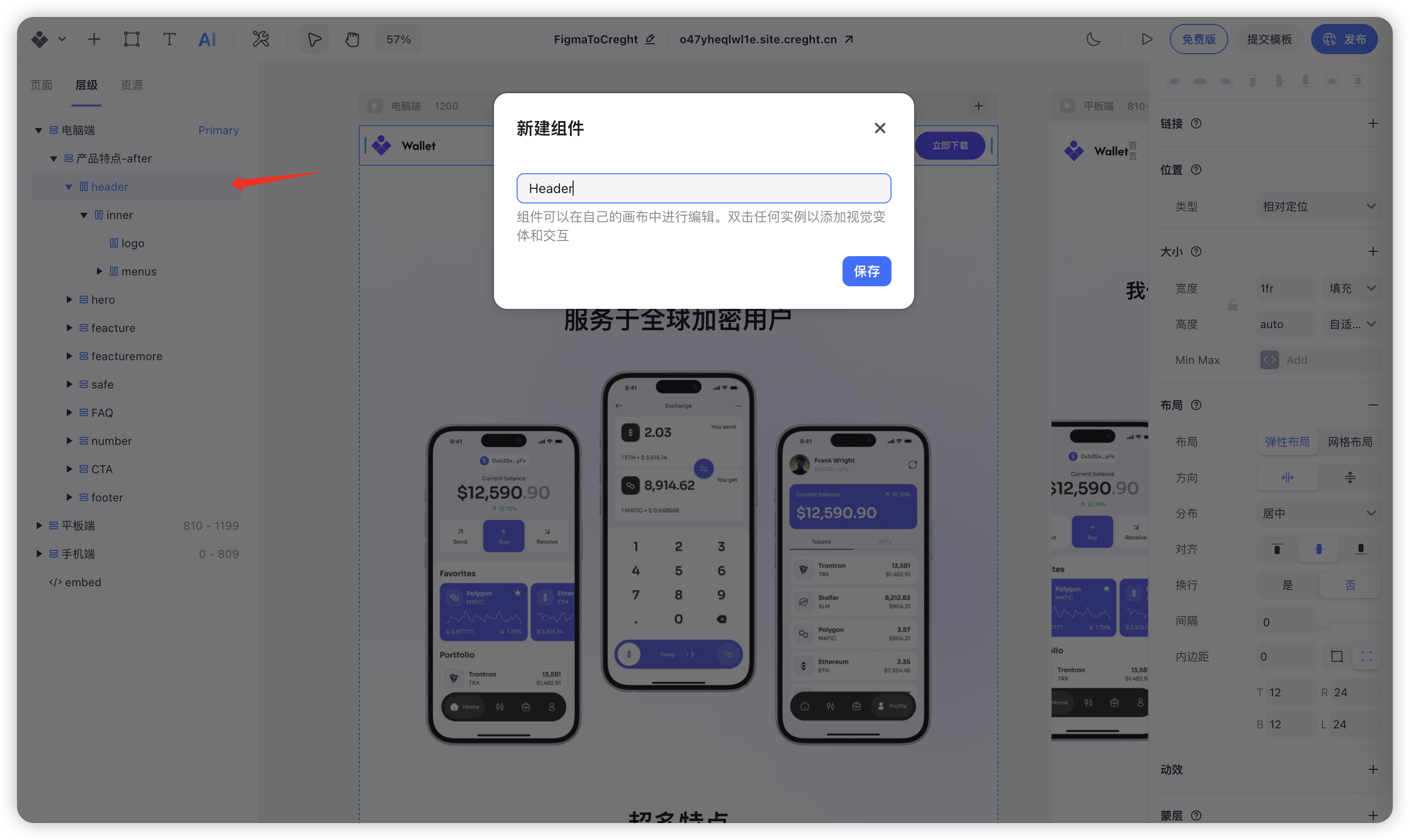
Step 1: Create the Header Component
- Select the entire navigation section.
- Right-click and choose “Create Component”.
- Name it “Header”.
Step 2: Create a Reusable Menu Item Component
1. Create the Menu Item Component
To keep your design consistent, we’ll turn each menu item into a reusable component.
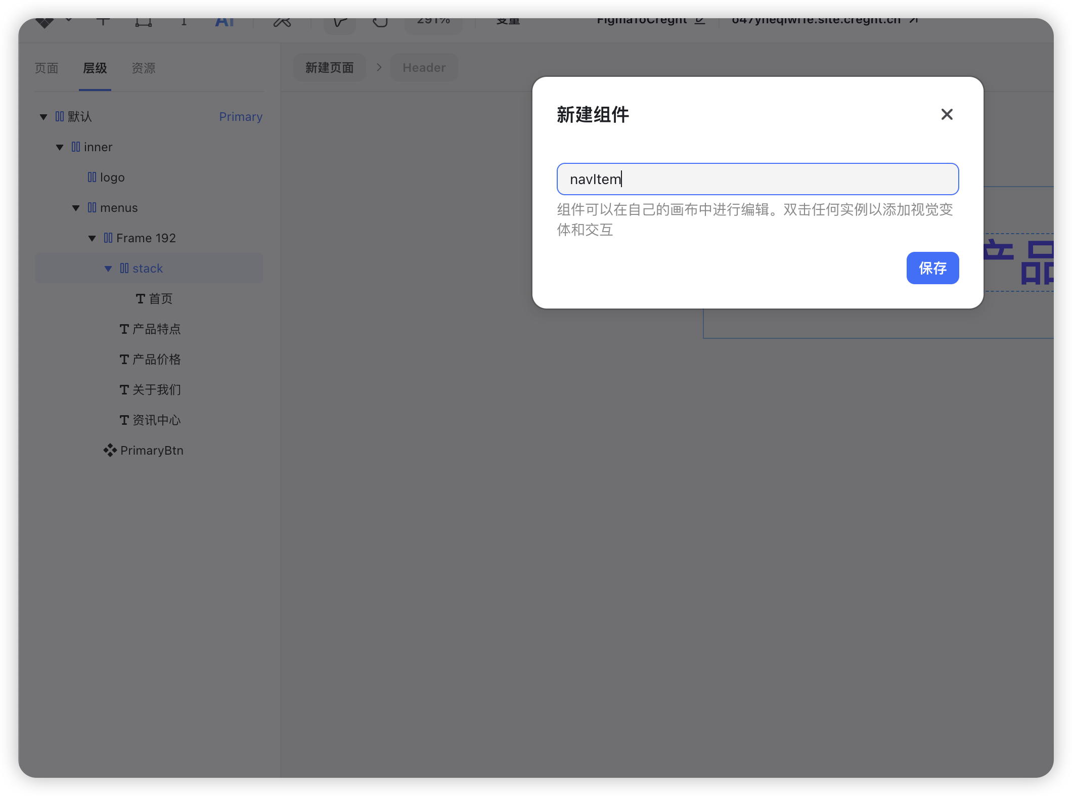
- Select a single menu item (e.g., “Home”).
Wrap it inside a Frame, then right-click and choose “Add Stack”.
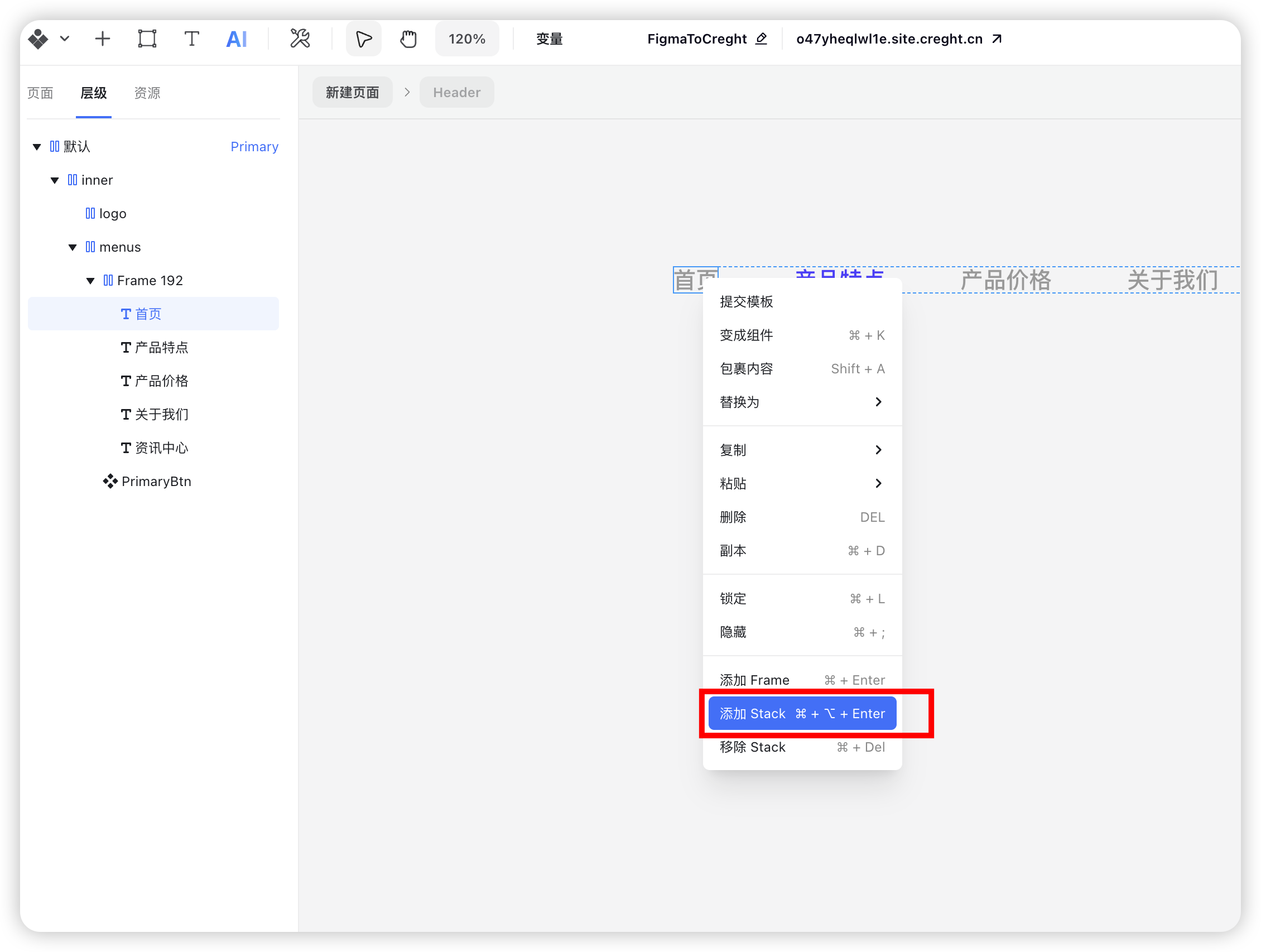
Right-click the menu item container, select “Create Component”, and name it “NavItem”.
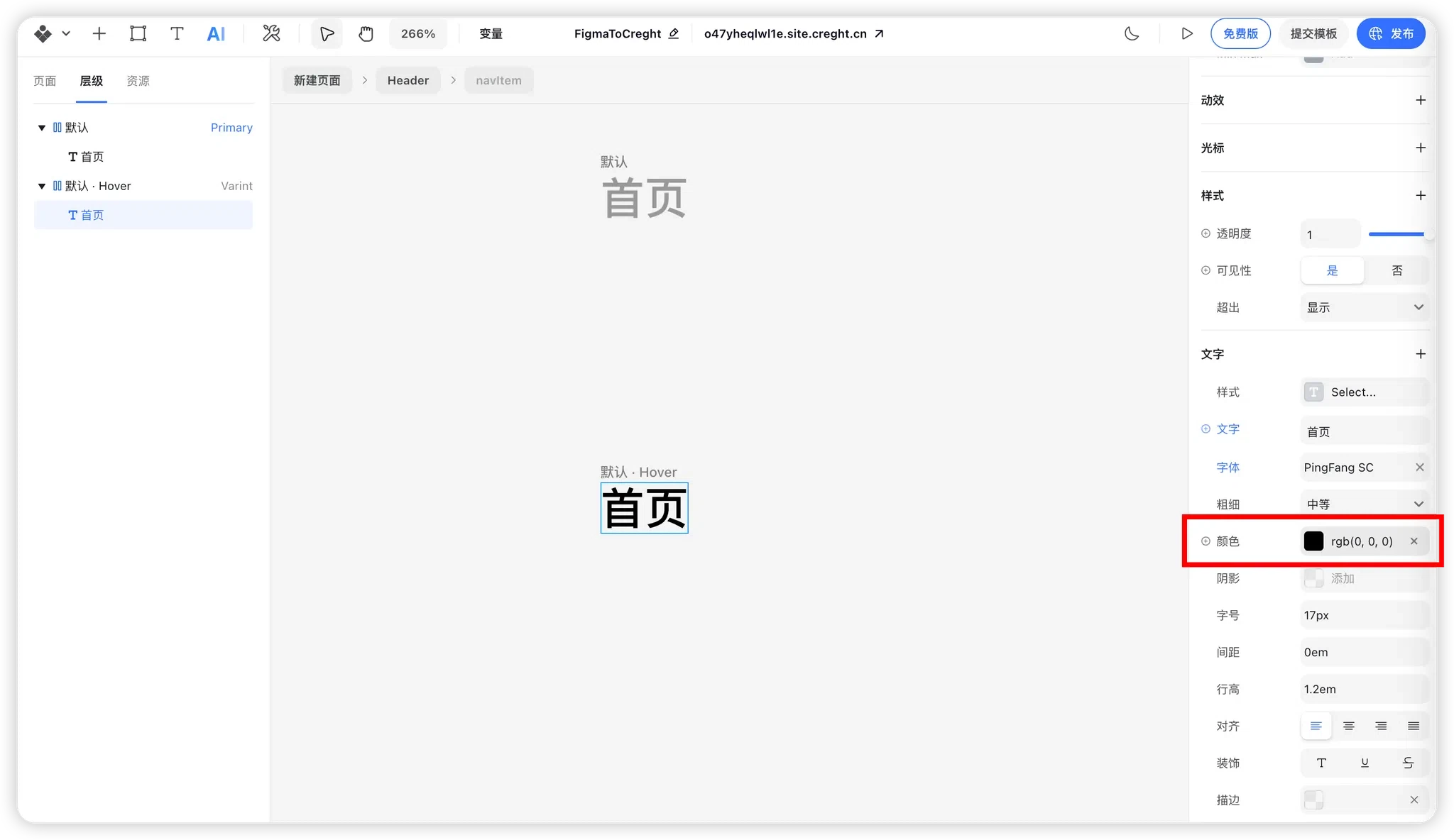
2. Add Hover Interaction
- Enter the NavItem component edit mode.
- Select the root component and add a Hover variant.
In the hover state, change the text color to black (or any color you prefer).
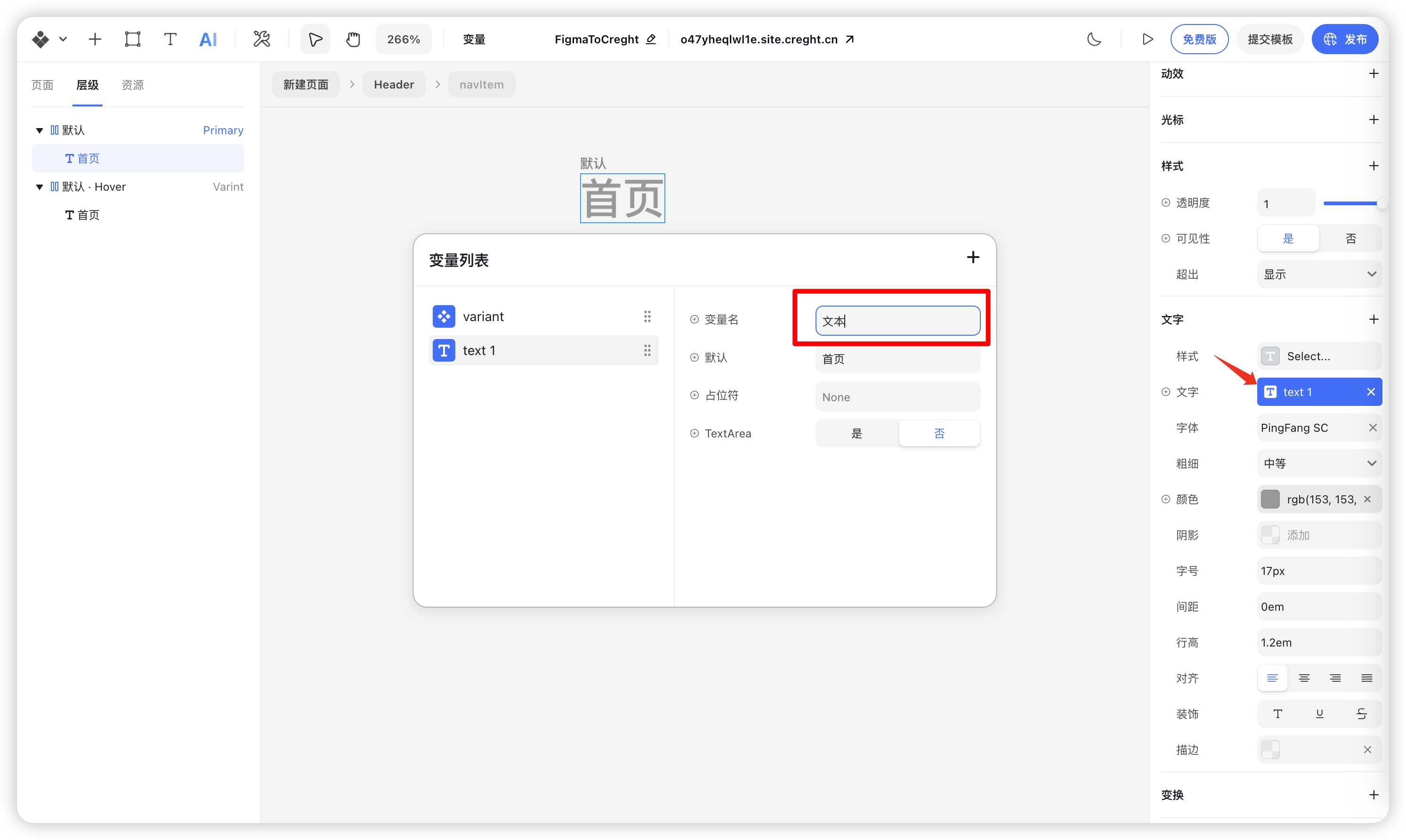
3. Create Component Variables
Text Variable
- Select the text layer inside the NavItem component.
In the right panel, right-click the text property and choose “Create Variable”.
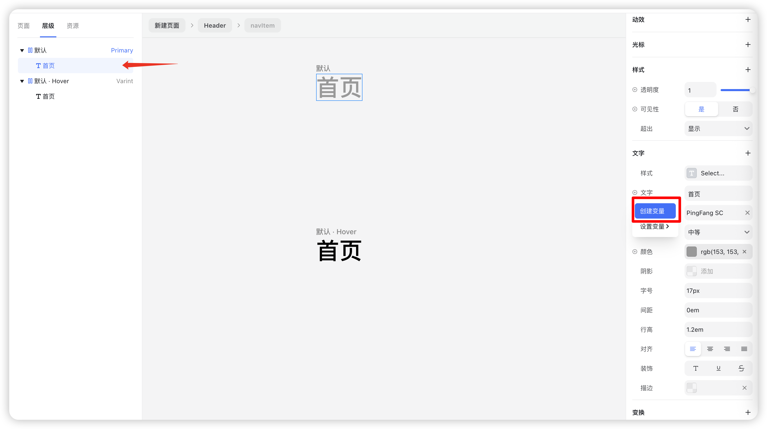
Rename the variable for clarity and easy management.
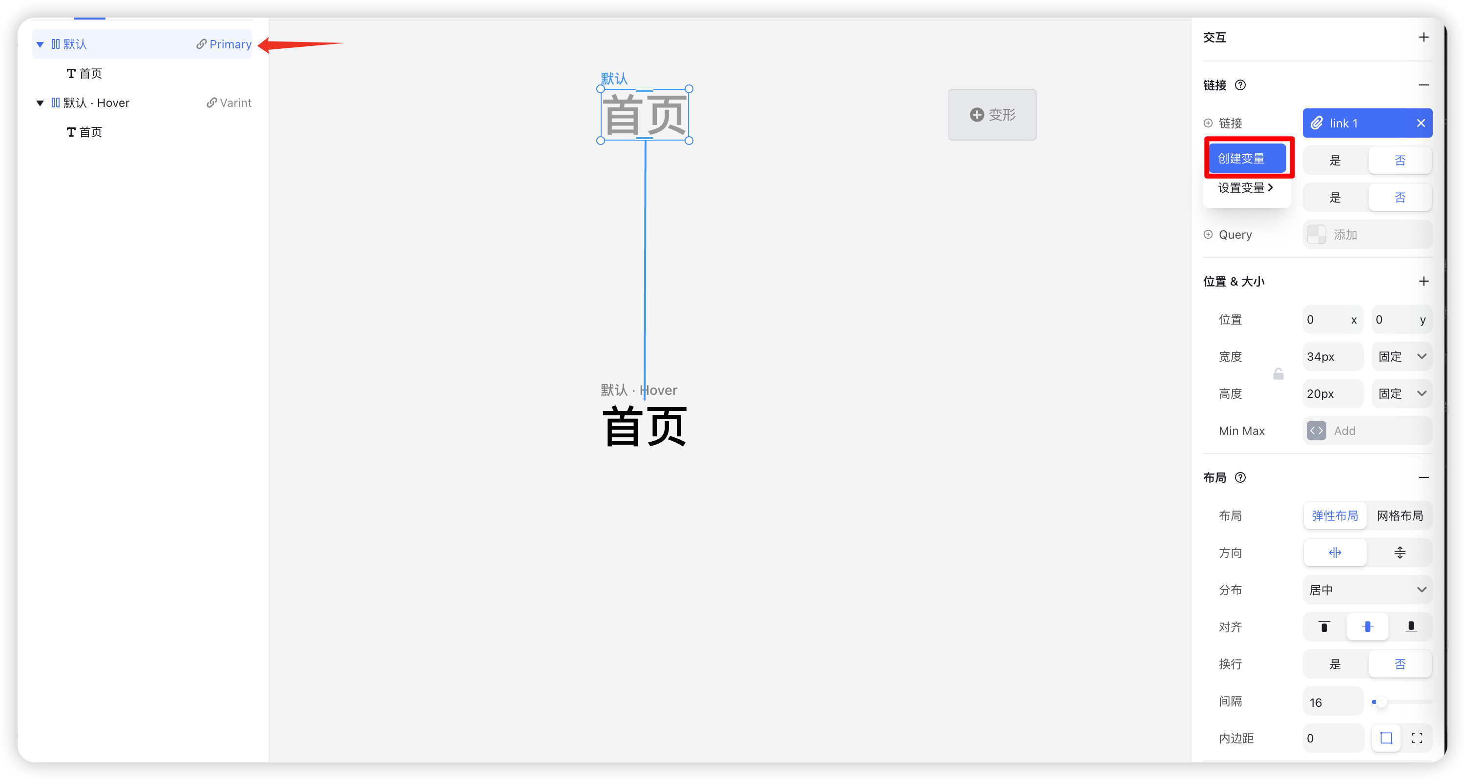
Link Variable
- Select the outer container of the NavItem component.
- In the right panel, find the Link property and click the "+" icon.
Right-click the link property and choose “Create Variable”.
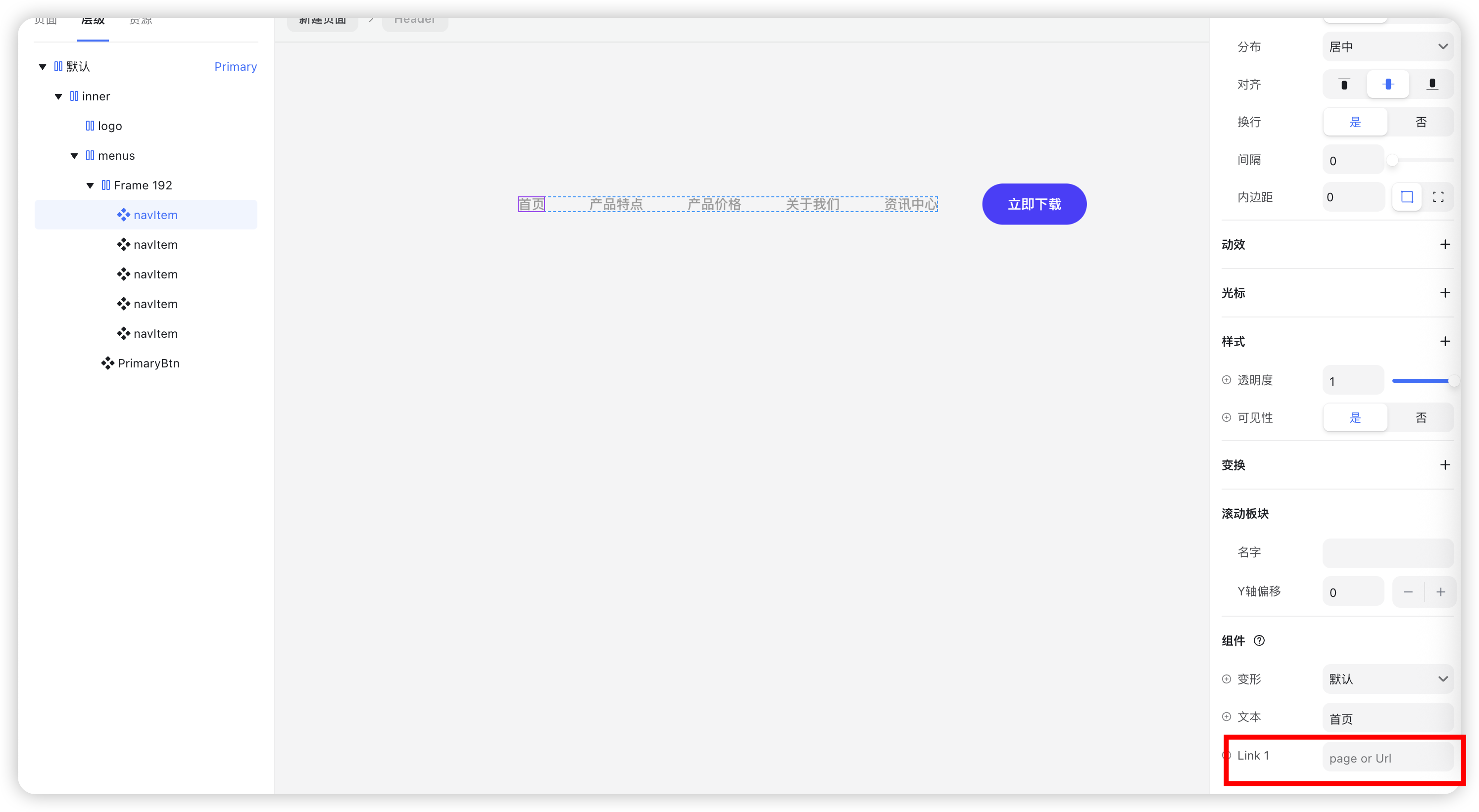
Step 3: Apply the Menu Item Component
- Go back to the Header component.
- Replace all static menu items with the NavItem component.
Assign unique text and link values to each one.
Preview your design — when hovering over a menu item, the text color will change as expected.
Live Demo
Why Use Componentized Menu Items?
- Update Once, Apply Everywhere: Edit one style and it updates across all menu items — keeping your design consistent.
- Flexible Configuration: Turn dynamic content like text and links into variables for faster iteration.
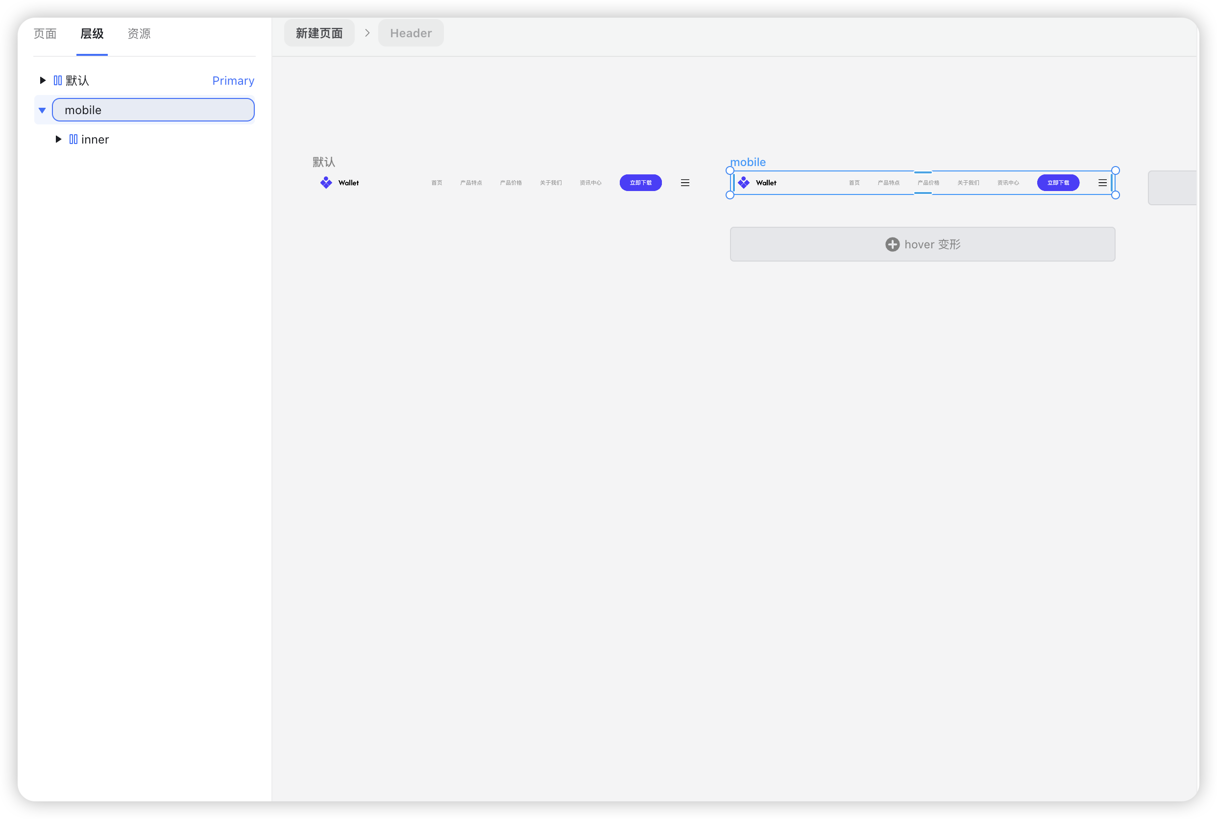
Step 4: Create the Mobile Navigation
1. Add Mobile Navigation Elements
- Click the “+” icon in the top-left corner and switch to the Popup panel.
Select “Navigation Popup” and drag it next to the right-side button.
2. Design the Mobile Navigation Content
Select the menu and download button layers, press Ctrl + C to copy, and paste them inside the popup container.
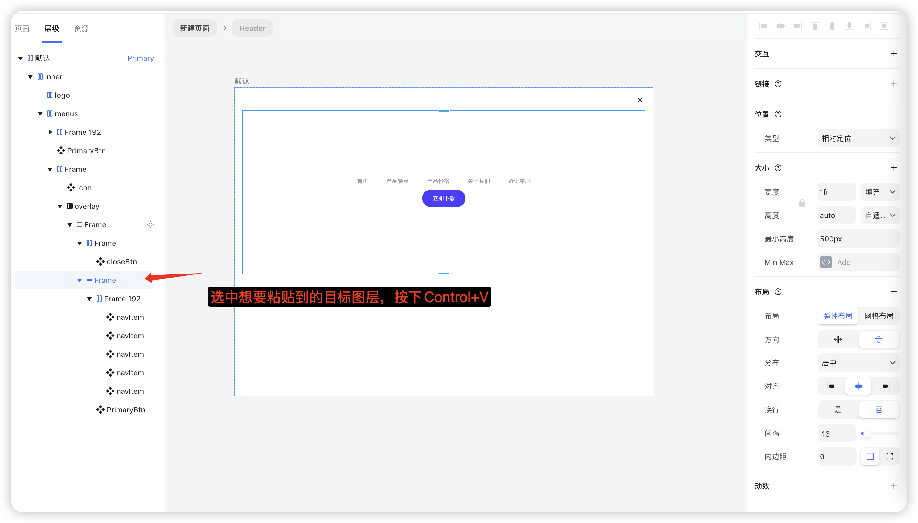
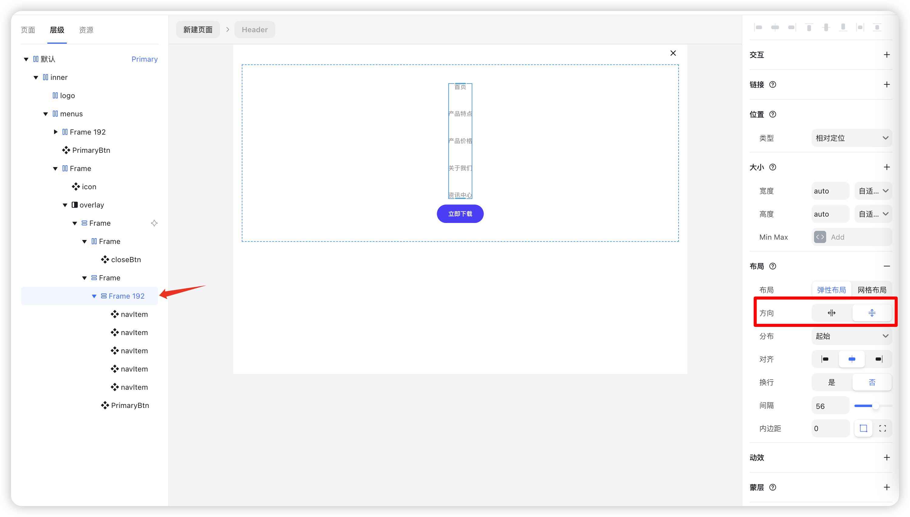
Change the menu layout from horizontal to vertical.
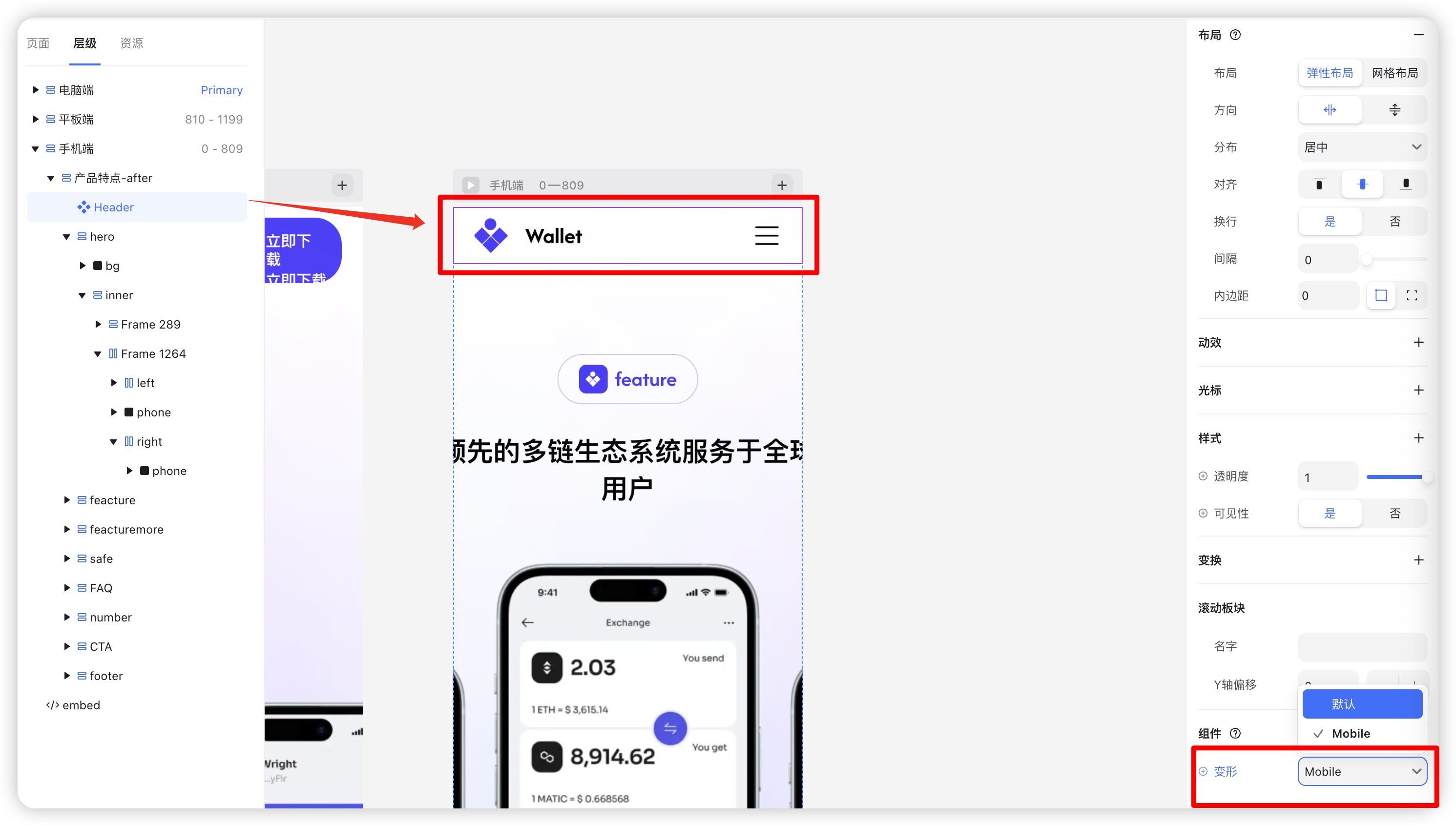
3. Set Up Component Variants
Select the Header component and click “+ Variant” to create a new one.
Rename this new variant to “Mobile”.
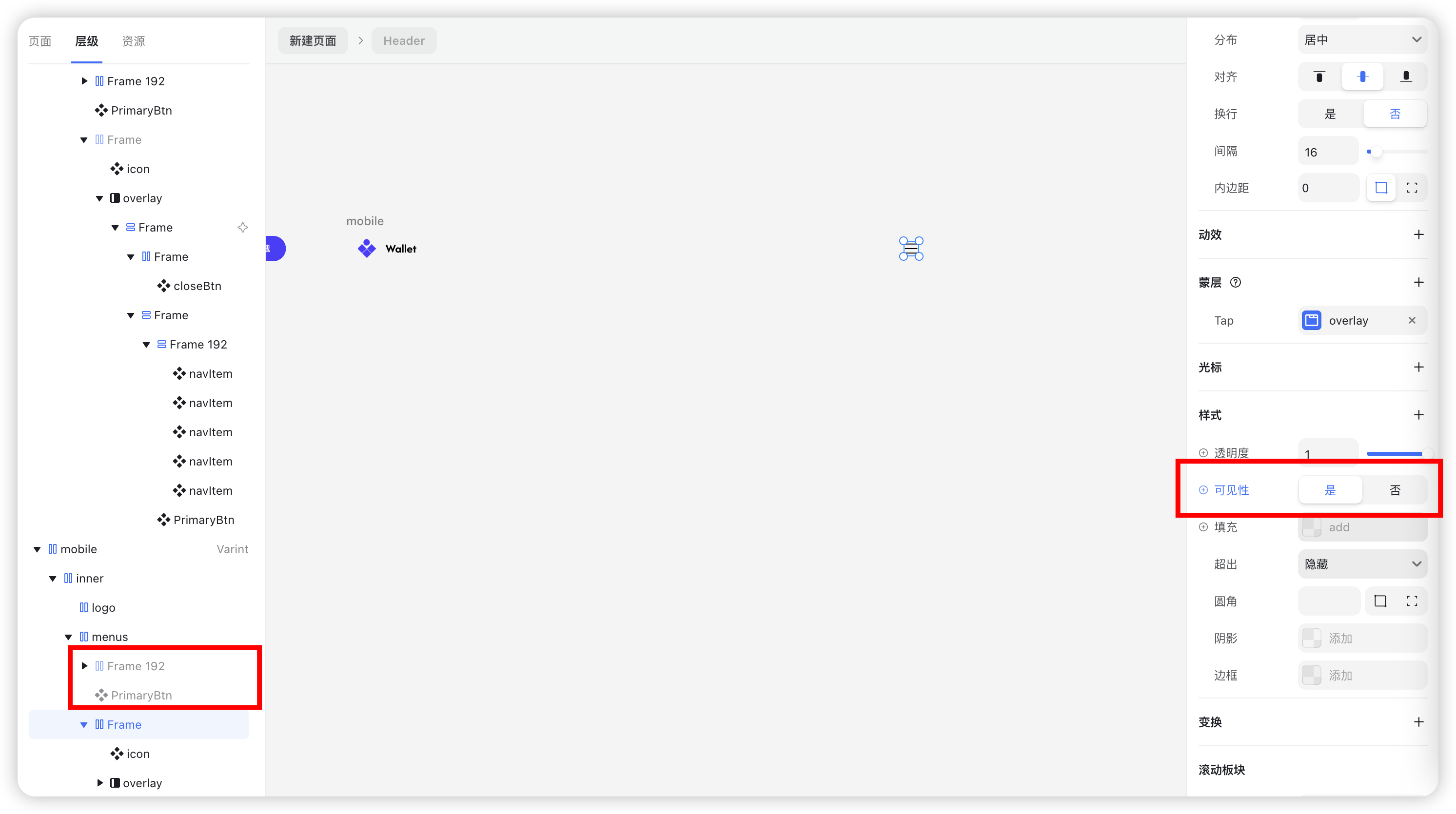
In the Primary variant (default), hide the mobile navigation component.
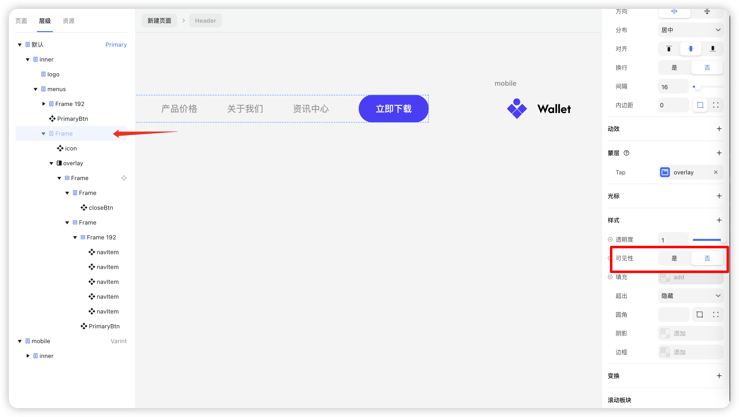
In the Mobile variant, show the mobile navigation and hide the regular menu and download button.
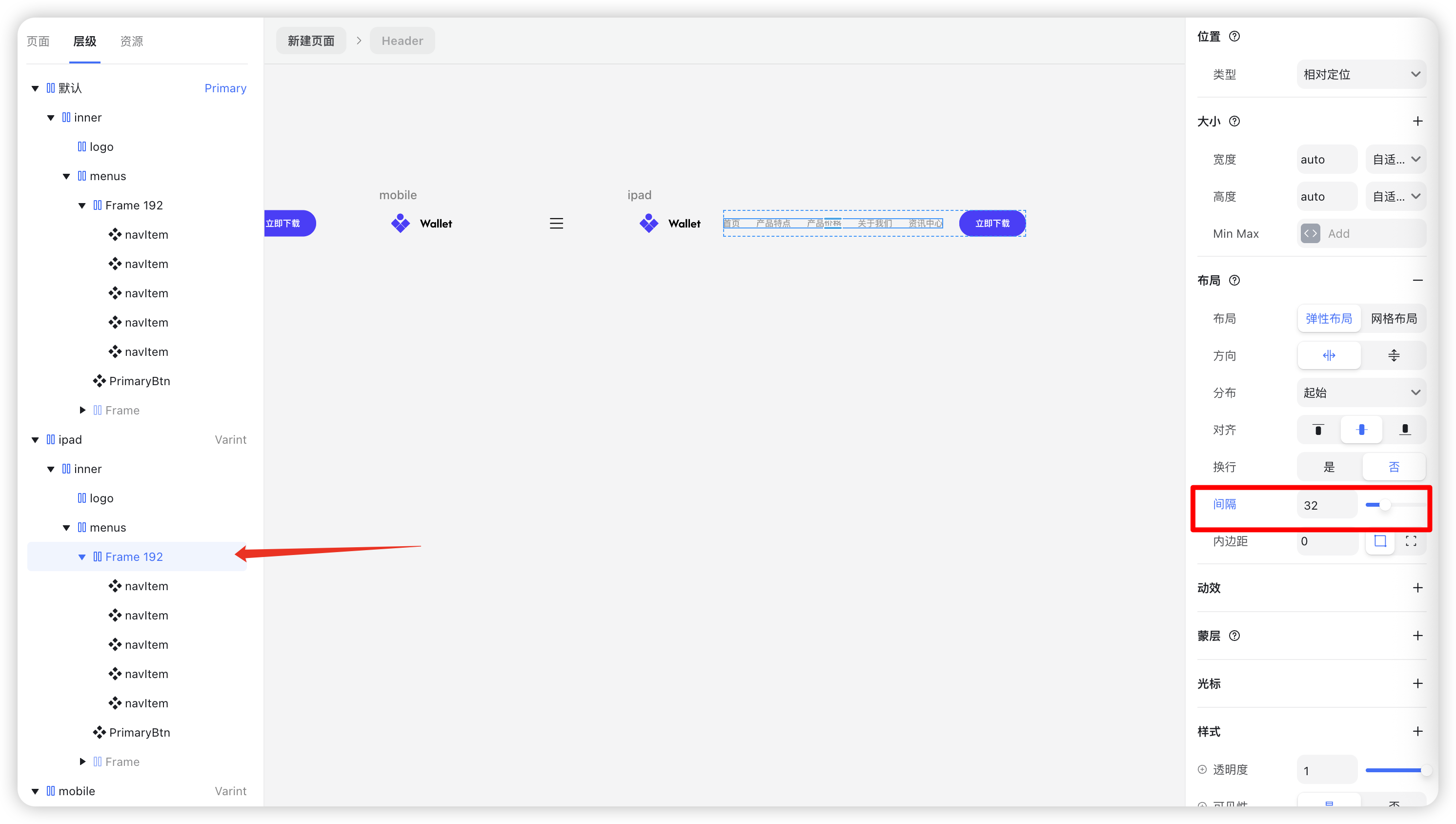
Step 5: Create a Tablet Variant (Optional)
If your design requires a dedicated tablet layout, follow these steps:
- Add another variant and name it “iPad”.
Set the width (e.g., 810px).
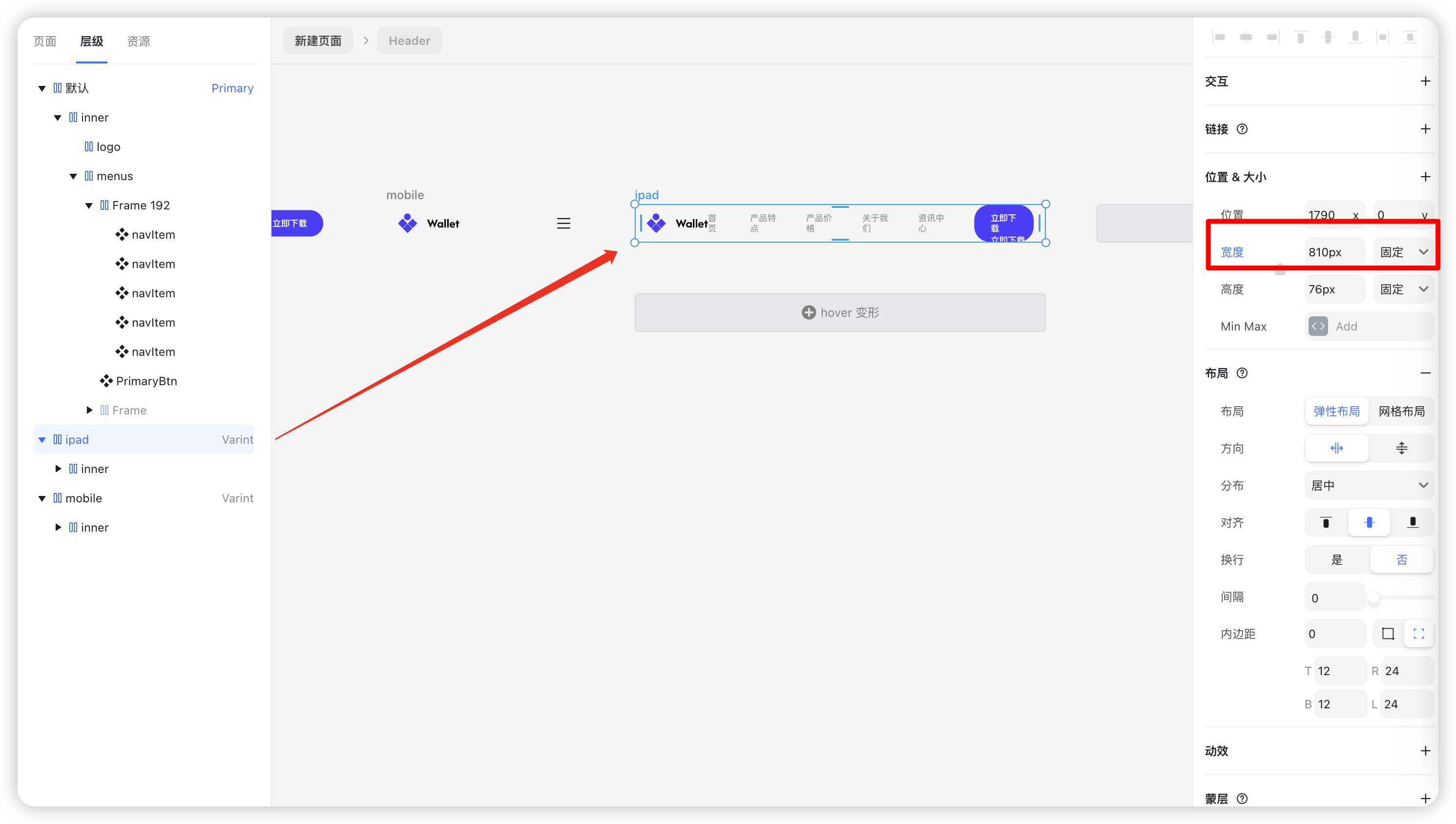
- Adjust spacing between menu items to 32px.
- Update the right-side container spacing to 32px as well.
Step 6: Apply Responsive Variants
Assign each variant to the appropriate breakpoint:
- Desktop → Primary
Tablet → iPad

Mobile → Mobile
Preview your design — your responsive navigation should now adapt automatically across devices.

Final Result
Your responsive navigation bar will now have:
- A horizontal layout on desktop
- Adjusted spacing on tablet
- A hamburger menu with vertical navigation on mobile
- Hover interactions for all menu items
- Fully customizable text and link properties
With this tutorial, you’ve built a complete responsive navigation system — efficient, reusable, and easy to maintain — all while following a clean, component-based workflow.