.png?w=3072&fmt=webp)
Design
/
Components in Creght
Last updated:
2025-08-28
Elements such as frames and text elements are the basic building blocks of a page. When you need to reuse elements across multiple pages or locations, you can convert them into components. Common examples include button components and navigation components.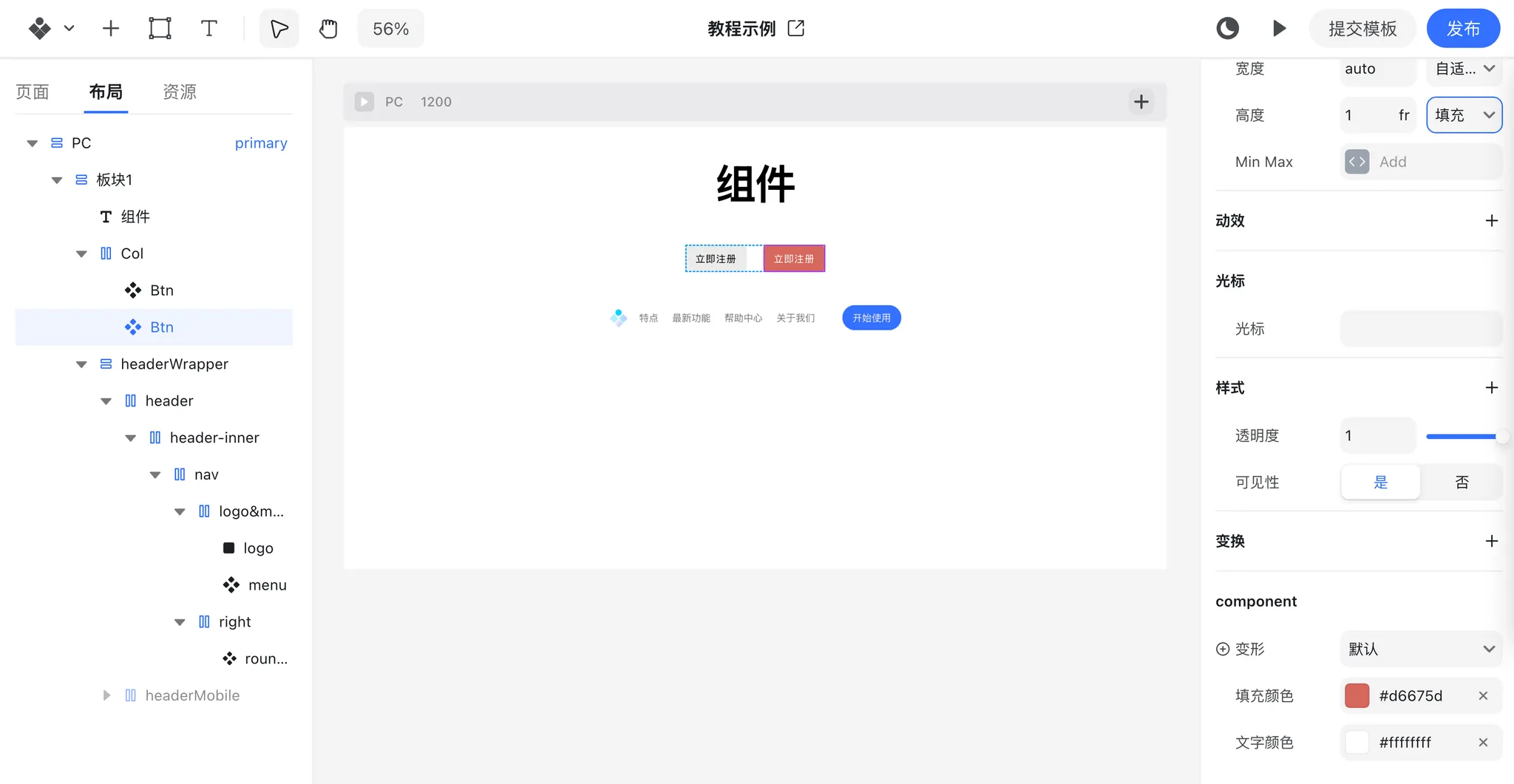
Creating a Component
- Select a group of elements you want to reuse.
- Right-click and choose “Create Component”.
- The newly created component will be added to your Assets panel.
- Drag the component from the Assets panel onto the canvas whenever you need it.
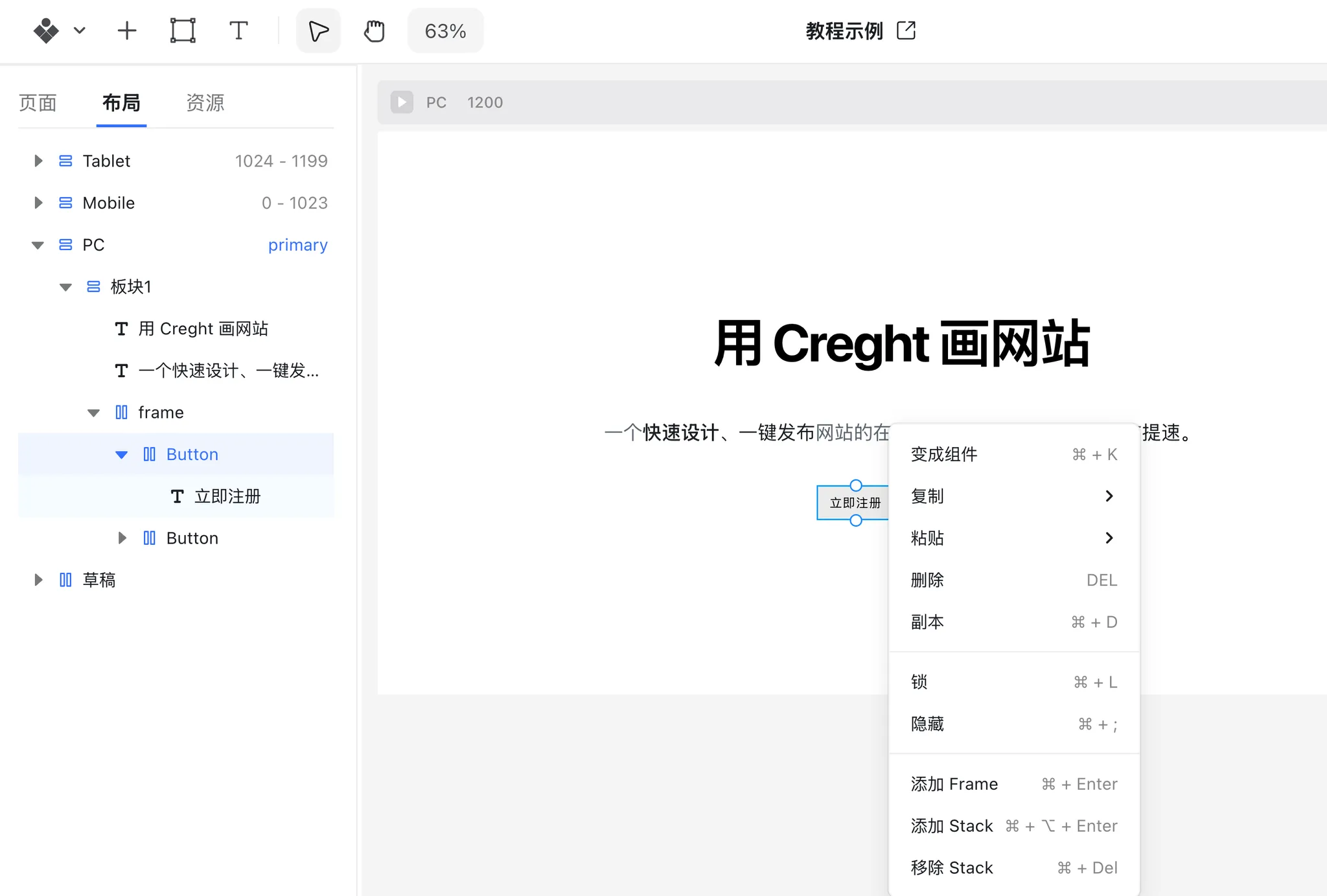
Detaching a Component
- Select the component on the canvas.
- Right-click and choose “Detach Component”.
- The component will be broken down into its original elements at the same position.
Component Variants
Components can have multiple variants, allowing you to create different styles or states. For example:
- Buttons can have hover and pressed states.
- Buttons can also have primary and secondary styles.
These different appearances are managed using variants.
Adding a Hover Variant
- Select the root element of the component.
- Click “Add Variant” to create a new variant.
- When a component has multiple variants, you can switch between them in the component’s Properties Panel.
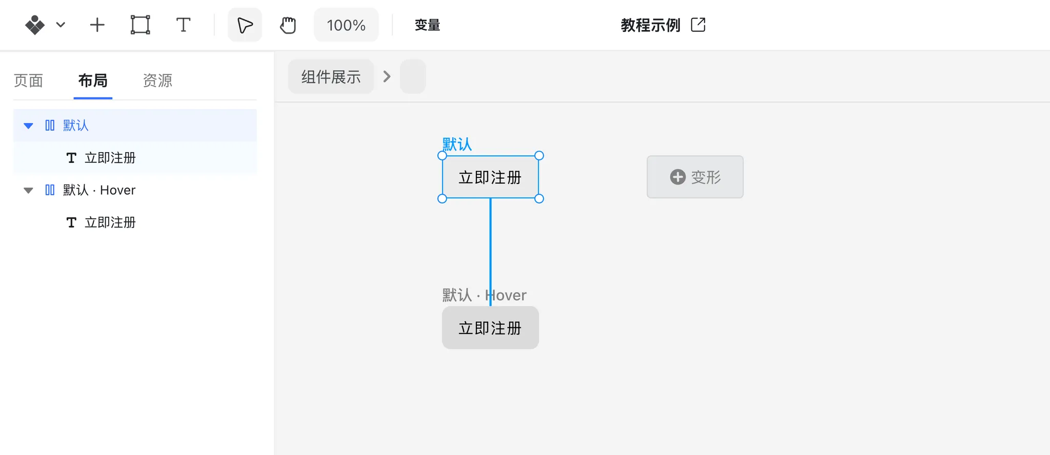
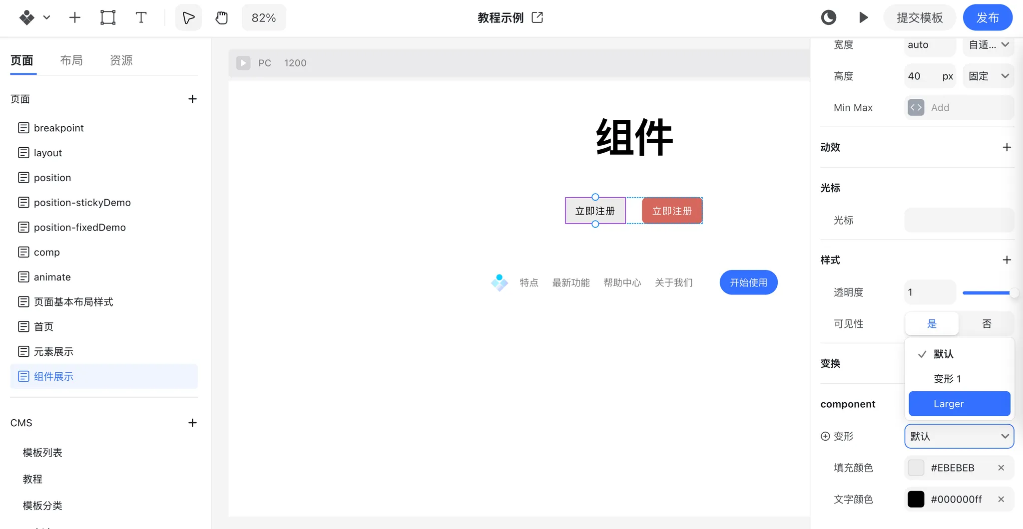
Transition Effects Between Variants
If the same element has different properties (e.g., color) across variants, Creght will automatically add a 0.3s transition when switching between variants, creating smooth visual effects.
This version keeps a professional tone, clear hierarchy, and uses step-by-step instructions suitable for a help center.