.png?w=3072&fmt=webp)
/
Layouts in Creght
Last updated:
When you select a container, you’ll see the Auto Layout panel in the settings sidebar. Auto Layout controls how child elements are arranged inside the container.
By default, a container does not have Auto Layout enabled—this is called Free Layout. In Free Layout, child elements can be dragged to any position:
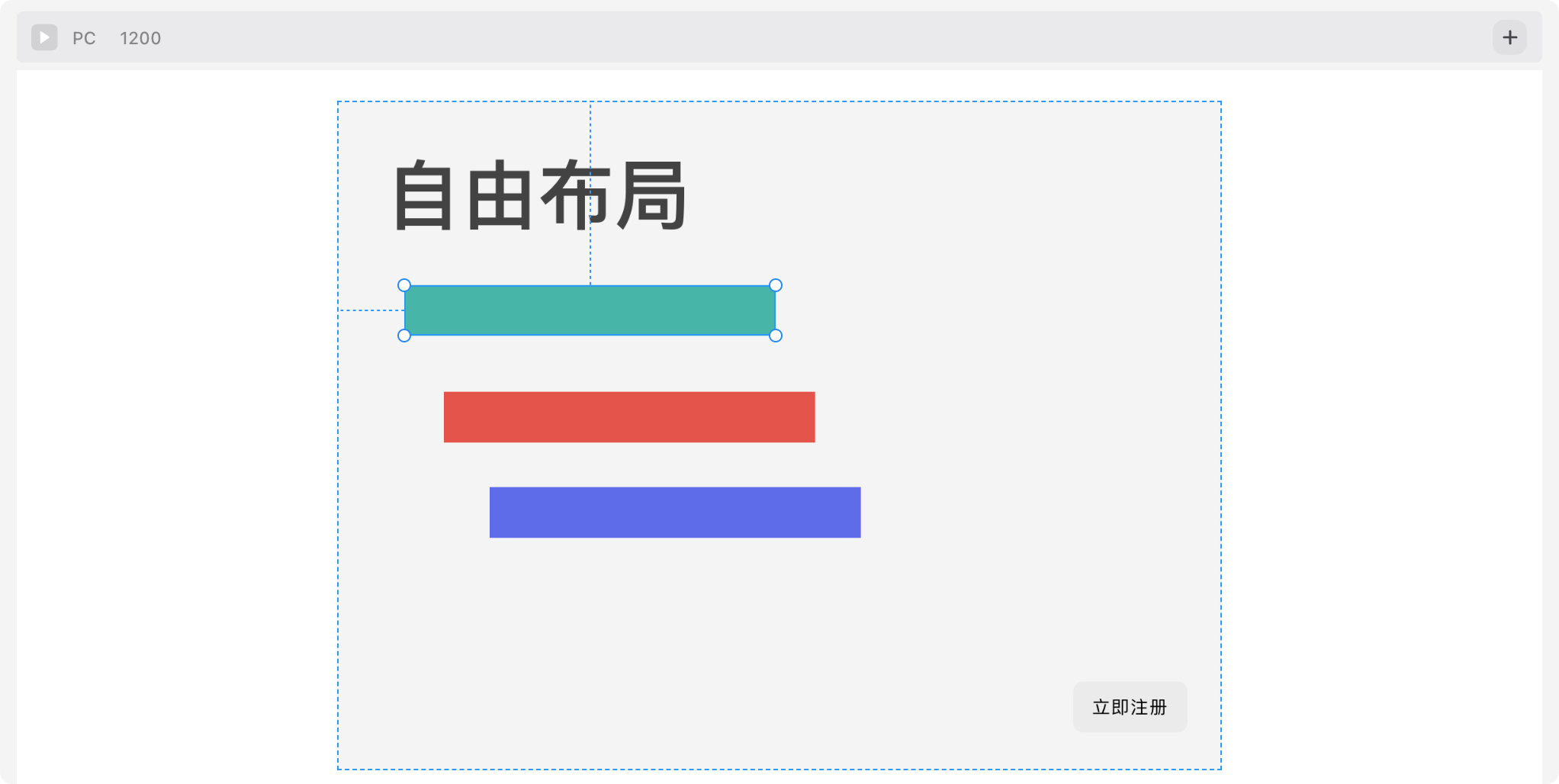
Free Layout is rarely used in web design because it’s not responsive. It’s typically applied only in small, local areas (e.g., inside a complex icon).
What is Responsive Design?
Responsive Web Design is an approach that allows websites to adapt to different devices and screen sizes. It ensures a consistent user experience and makes content easy to read and use across all devices.
In modern web design, Auto Layout (similar to CSS flexible flow layouts) is used more often. In this mode, child elements are automatically arranged from left to right or top to bottom, making it the foundation of responsive design.
When you enable Auto Layout, several options appear. Let’s go through them in detail.
Flex Layout
Auto Layout has two types: Flex Layout and Grid Layout.
We’ll start with Flex Layout, which is the most commonly used.
Flex Layout makes it easy to control the size of child elements. For example, in a two-column layout where the left side is fixed at 120px and the right side expands to fill the remaining space, Flex Layout is ideal:
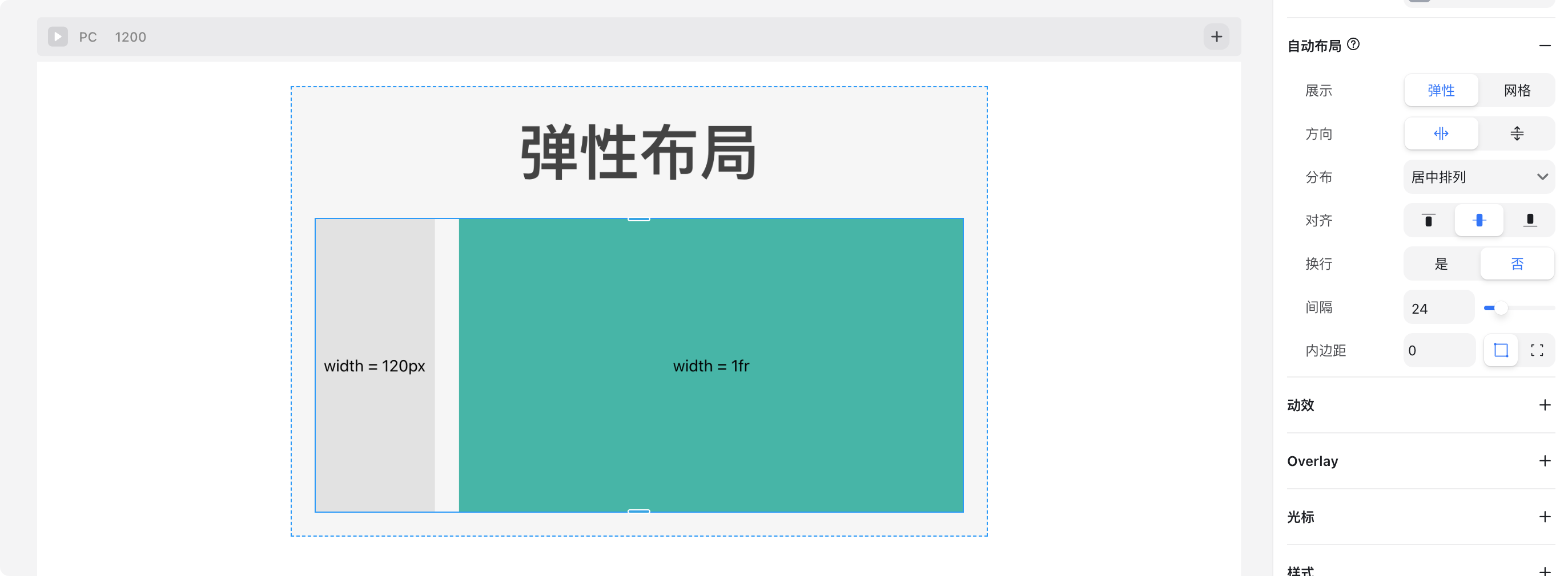
Flex Layout Options
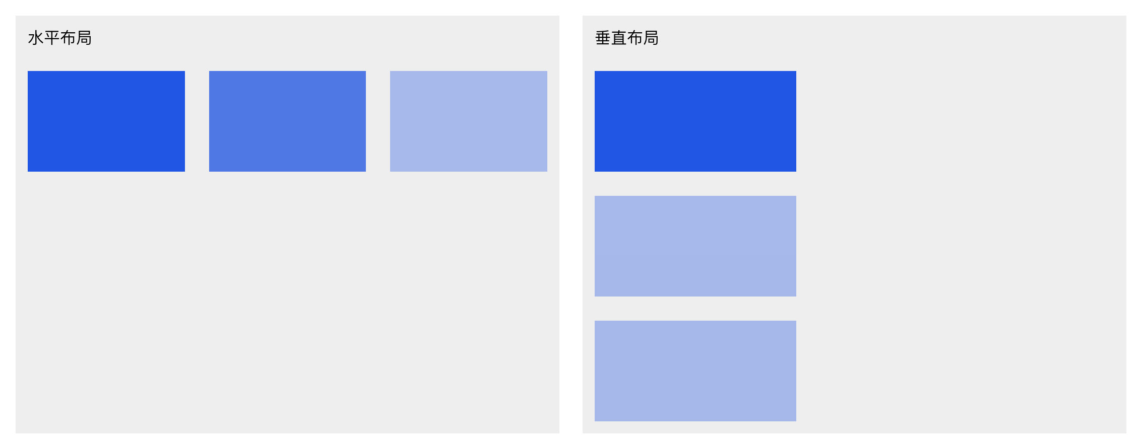
- Direction
- Horizontal
- Vertical
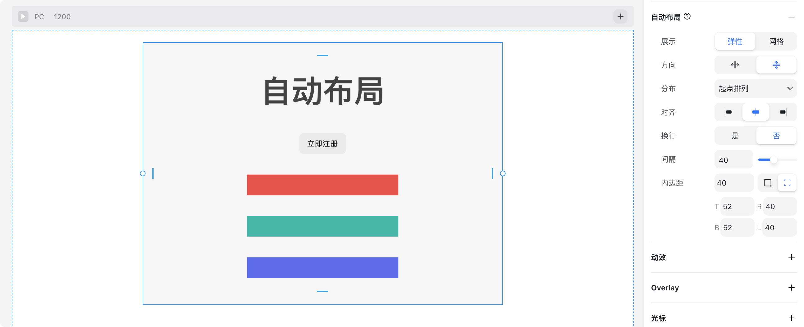
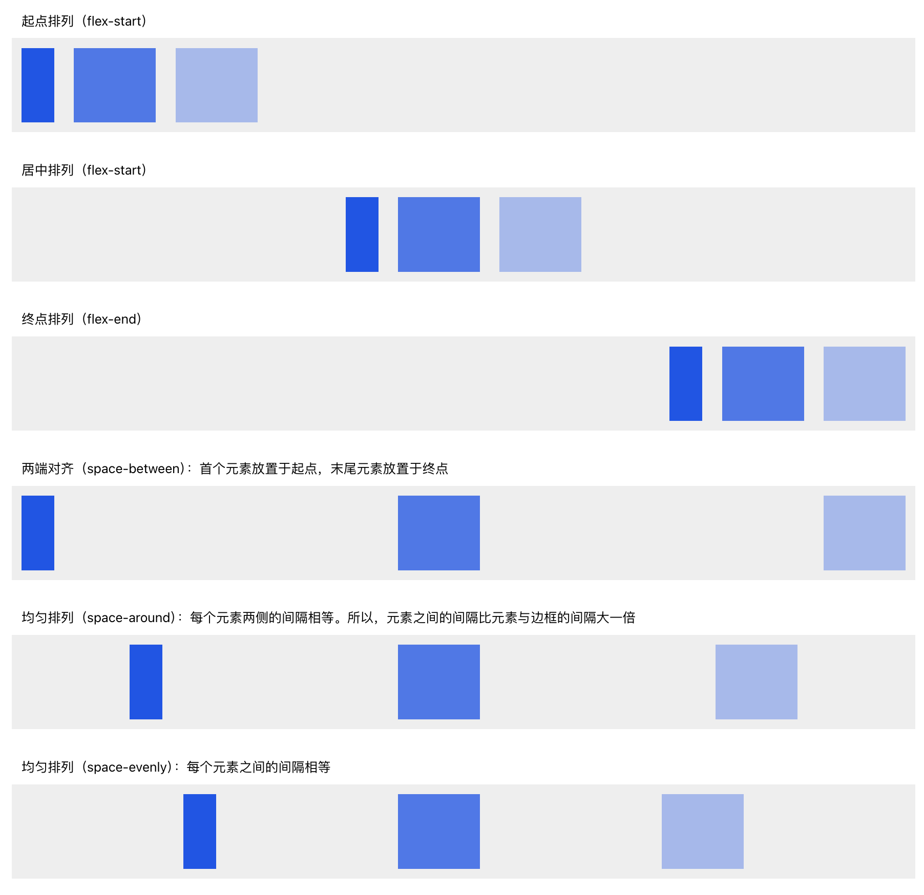
Distribute
Controls alignment along the main axis.The main axis is defined by the layout direction:
- Horizontal layout → main axis is X
- Vertical layout → main axis is Y
Example below shows horizontal layout:
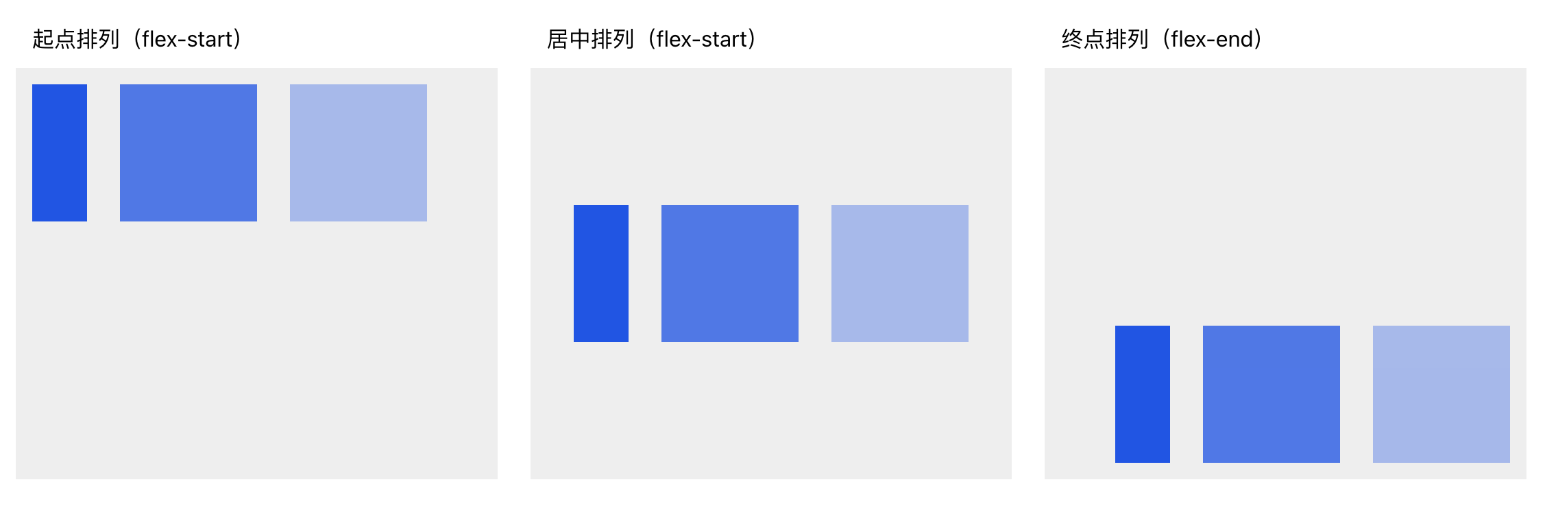
Align
Controls alignment along the cross axis (perpendicular to the main axis).For horizontal layout → cross axis is Y
For vertical layout → cross axis is XExample (horizontal layout, controlling Y-axis alignment):
- Gap
Sets spacing between child elements.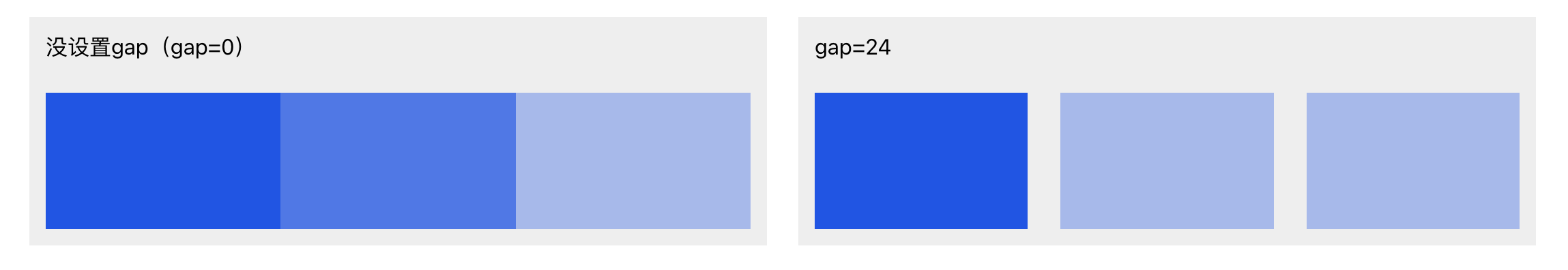
- Wrap
Controls whether elements automatically wrap to a new line when they exceed the parent container’s width.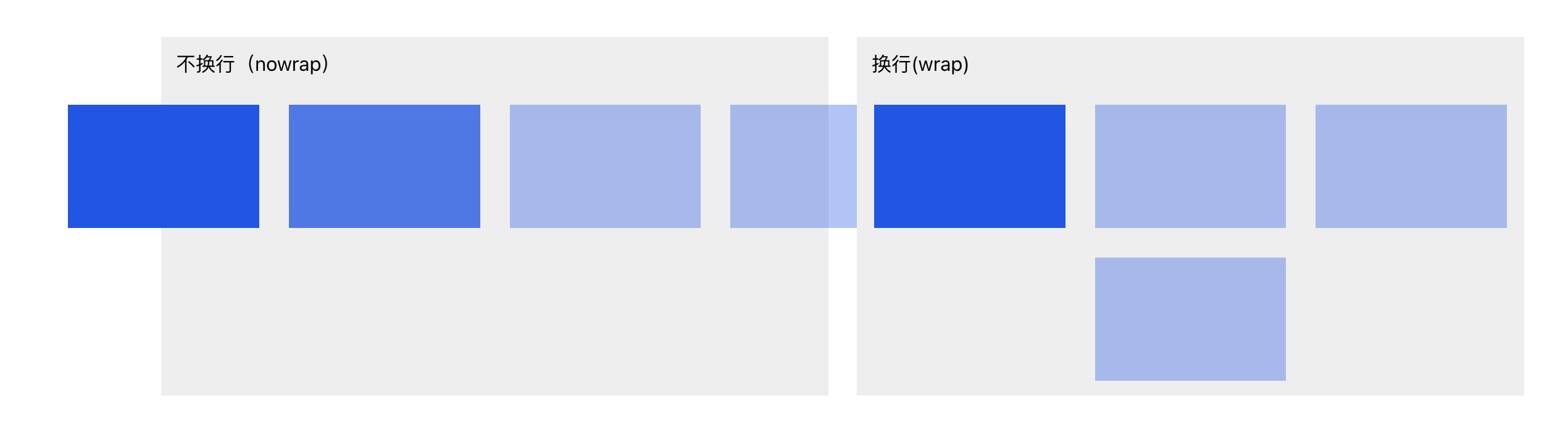
📚 More reference: Learn CSS Flexbox with Animations
Grid Layout
Grid Layout is used for more complex, non-linear designs.
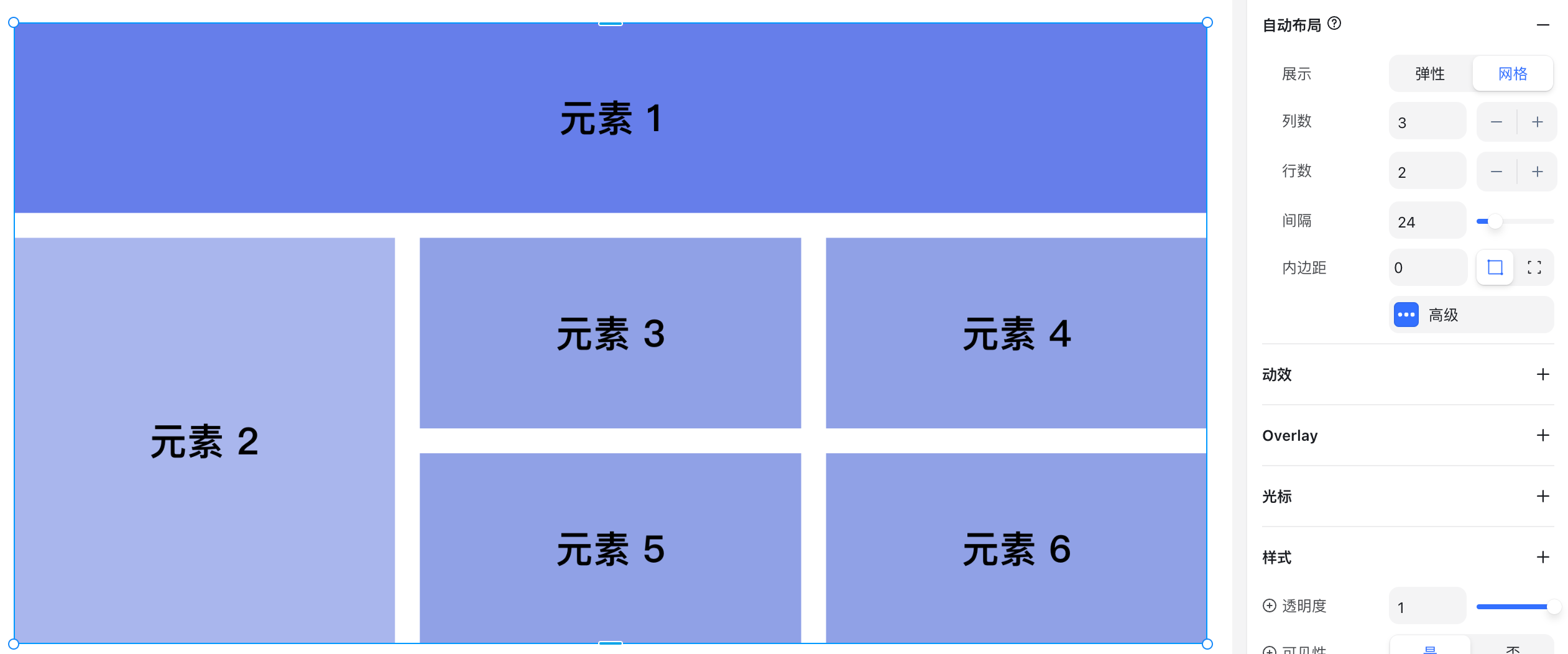
Grid Layout Options
- Columns: Number of columns
- Rows: Number of rows
- Gap: Spacing between grid cells
Advanced Layout
Advanced settings are used for more specialized scenarios and are not commonly needed. Here’s a quick overview:
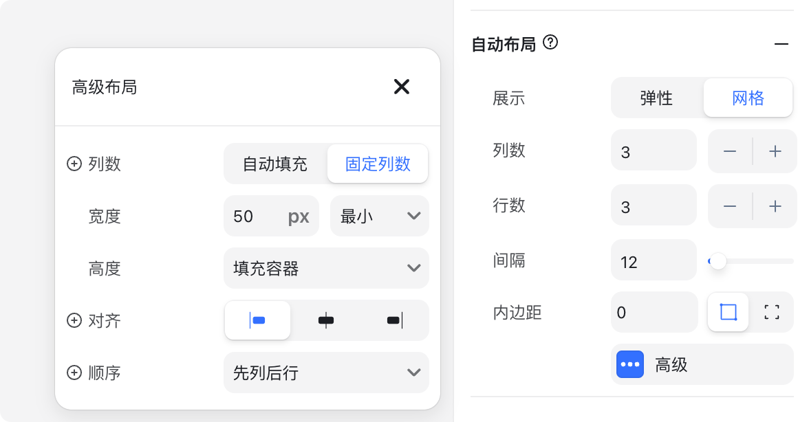
- Columns (auto): Often used when child elements have fixed widths, and the parent container width adjusts automatically.
- Width
- Min: Minimum grid width (e.g., 50px)
- Fixed: Fixed width
- Height
- Fill container: Fills the parent container height
- Fixed: Fixed height
- Fit content: Adjusts height to content
- Align: Horizontal alignment of child elements inside the grid (left, center, right).
Example: In a 6-column grid with only 3 items, alignment controls their horizontal position.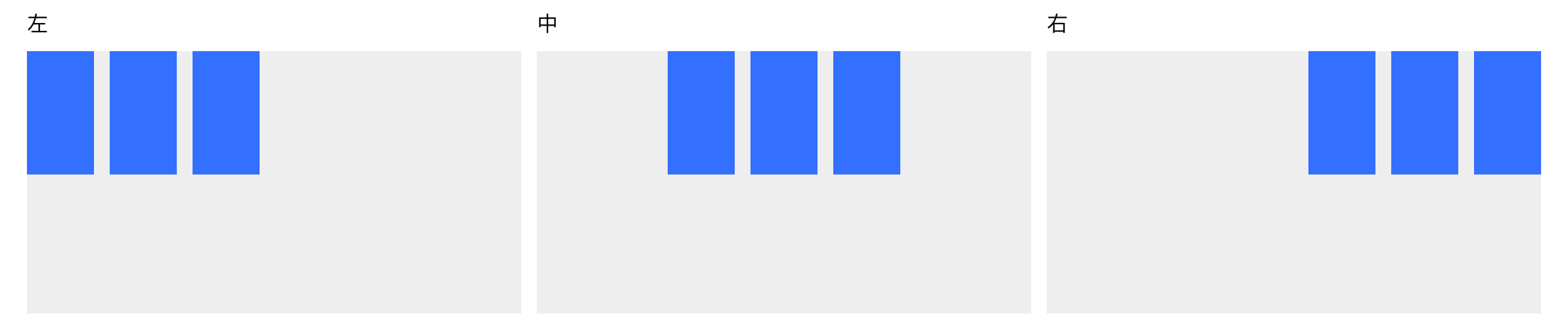
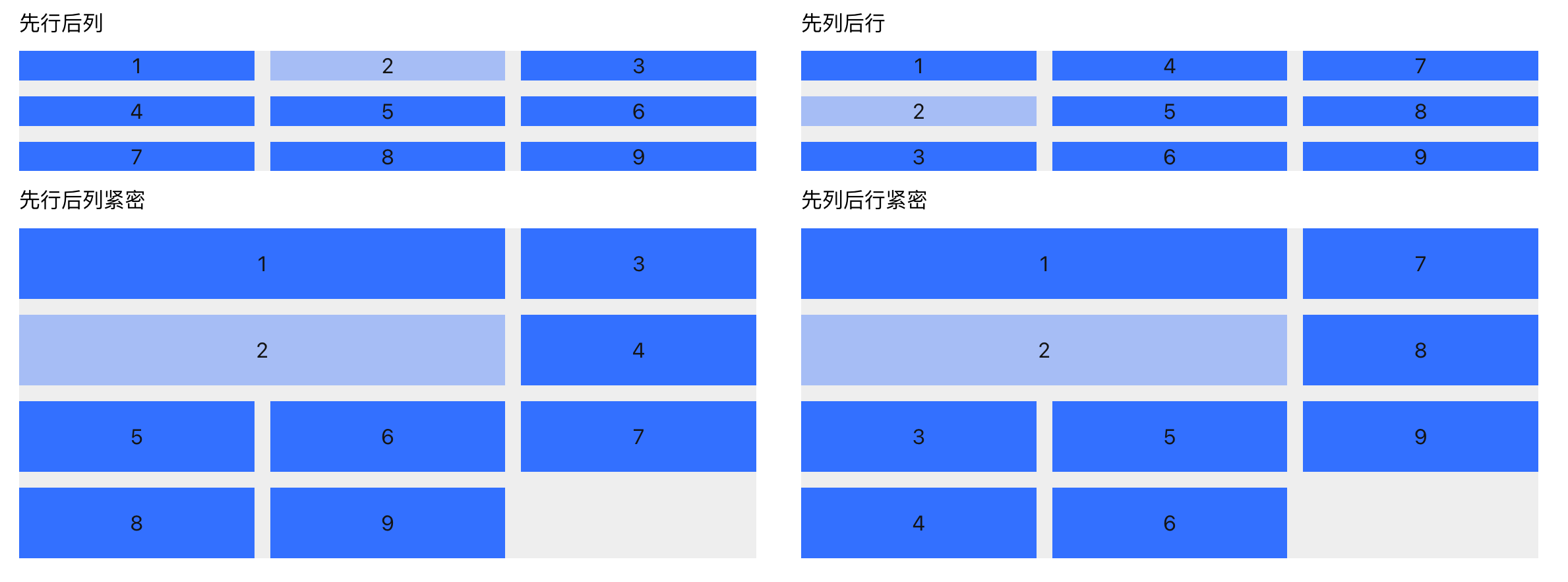
- AutoFlow: Controls the order in which child elements are placed inside the grid.
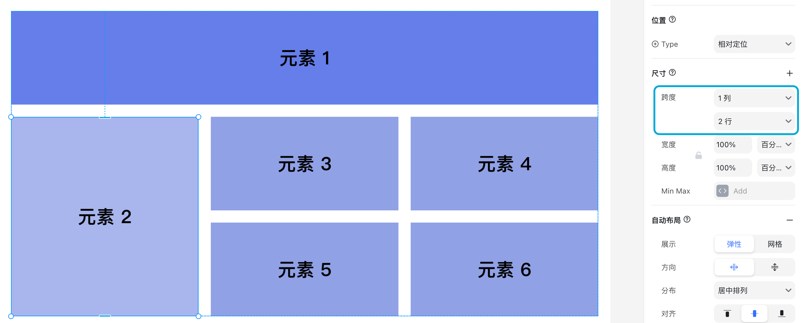
Grid Item: Span
When selecting a grid item, you’ll see special sizing options called Span. This controls how many rows or columns the item stretches across.