.png?w=3072&fmt=webp)
/
Size in Creght
Last updated:
Quick Start:
- Use Fixed for precise control over width/height.
- Use Percentage or Fill (fr) for responsive layouts.
- Use Auto for content-driven sizing (like text).
- Use Viewport for full/partial screen sections.
- Enable Aspect Ratio to maintain element proportions during resizing.
Select an element, then go to the Size panel in the right-hand settings sidebar to adjust its dimensions.
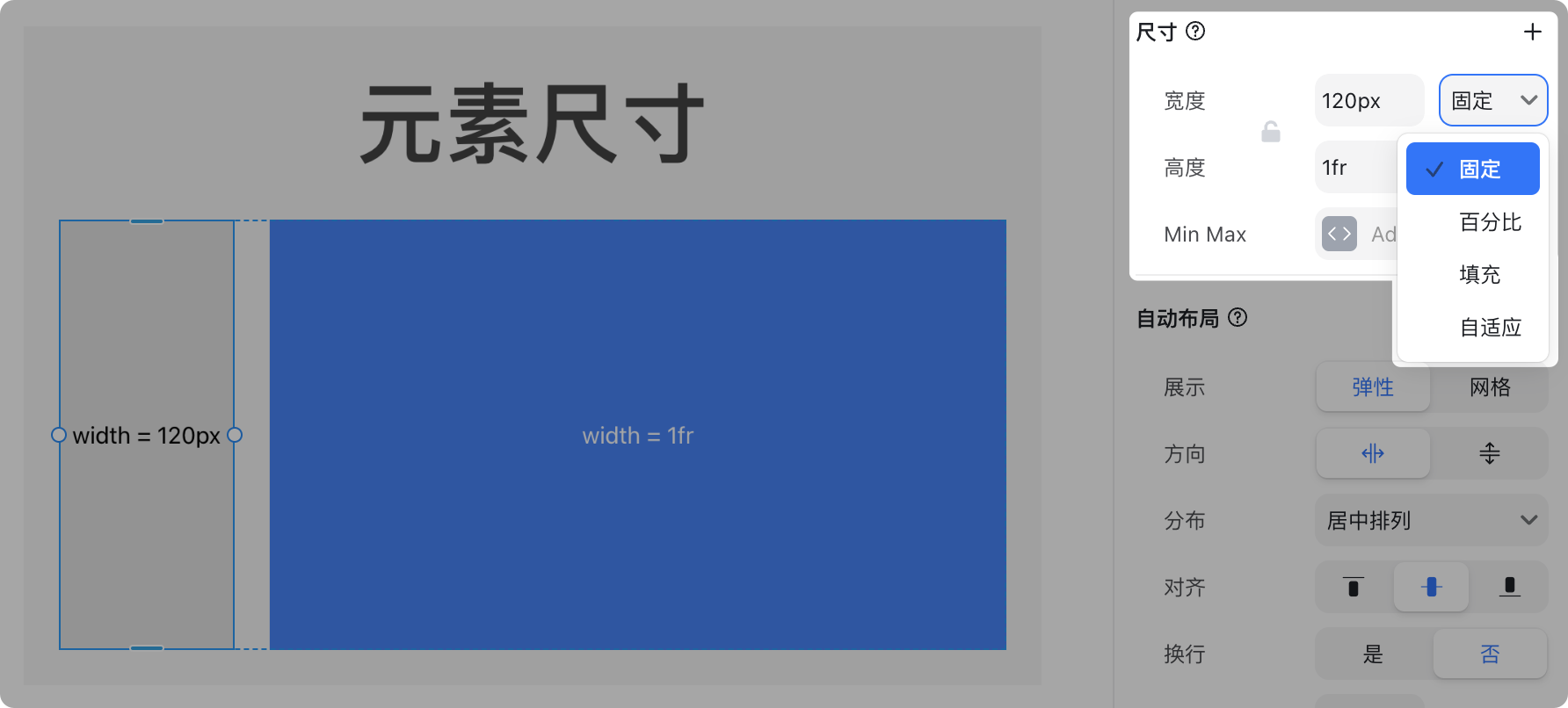
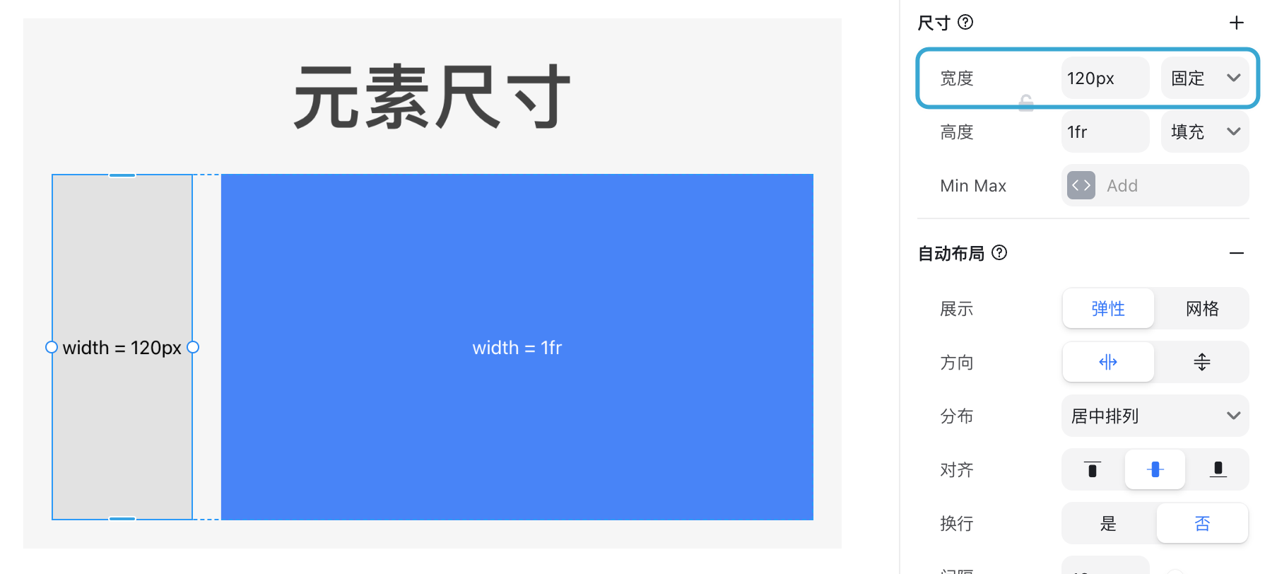
Width can be set as: Fixed, Percentage, Fill, or Auto.
Height has the same options, with an additional type: Viewport.
Size Types
Fixed
A fixed size assigns an exact value to the element.
For example, setting the width to 120px means the element will always remain 120px wide across all devices.
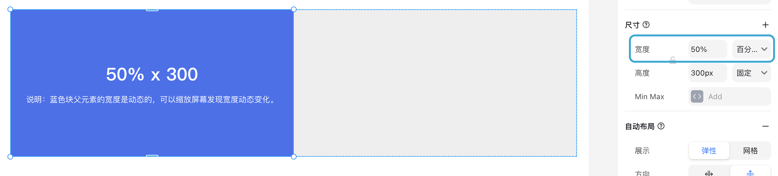
Percentage
Percentage size is based on the parent container’s size.
For example, setting the width to 50% makes the element half the width of its parent.
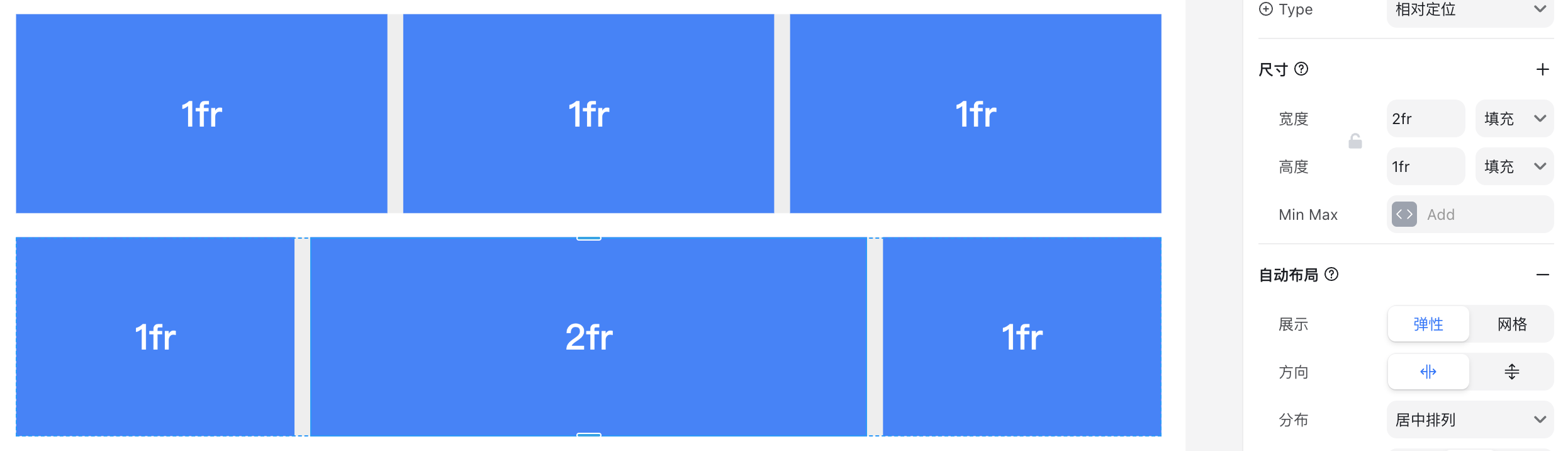
Fill (1fr)
When the parent uses Auto Layout, setting a child element’s width to Fill (1fr) makes it take up the remaining available space.
In the example below, the right element is fixed at 360px. The left blue block is set to 1fr, filling the rest of the parent container.
![image.png]
If multiple elements are set to Fill (1fr), the remaining space is divided equally.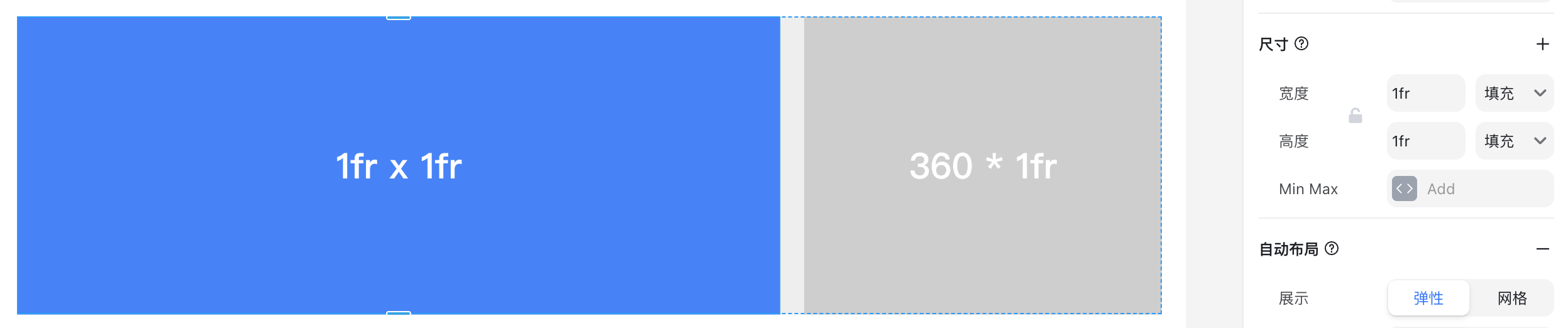
If one element is set to 2fr, it will take up twice as much space as the others.
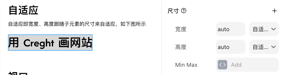
Auto
Auto size makes the element wrap its content.
For example, a text element will automatically adjust its width or height based on the text length.
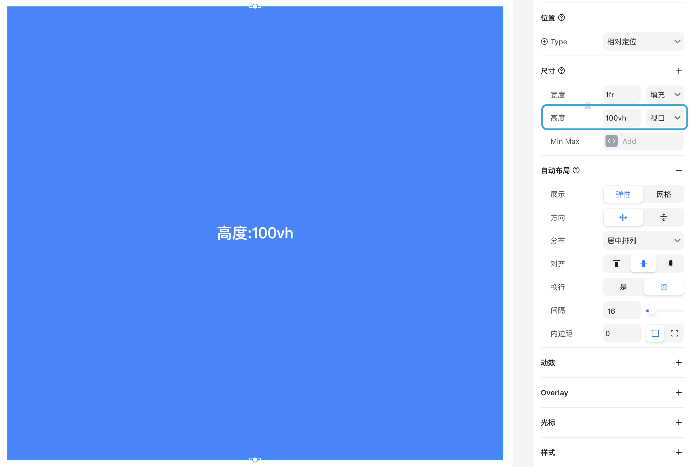
Viewport
Viewport size is based on the visible area of the browser window.
100vh= full viewport height50vh= half viewport height
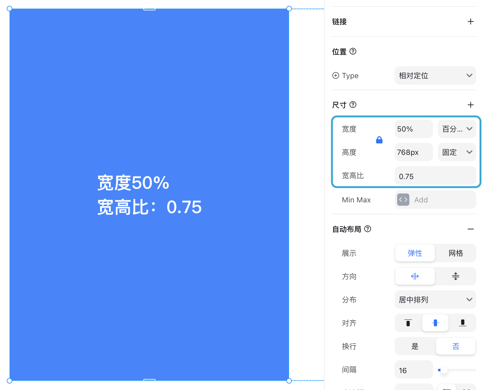
Aspect Ratio
Enabling the lock icon between width and height activates a fixed aspect ratio.
When enabled, the element’s proportions remain constant during resizing (e.g., when the browser width changes).
This is commonly used to display images without distortion.
⚠️ Note: Creght only supports height scaling according to width changes.
Size Type Comparison
| Type | Definition | Common Use Case |
|---|---|---|
| Fixed | Assigns an exact pixel value. The element size stays the same on all devices. | Buttons, icons, or elements requiring a precise size. |
| Percentage | Sets size as a percentage of the parent container. | Responsive layouts, making elements scale with their container. |
| Fill (fr) | Distributes remaining space within an auto layout. Multiple elements can share space proportionally (e.g., 1fr, 2fr). | Flexible grid layouts, equal or proportional columns. |
| Auto | Wraps the element around its content. | Text blocks or components that should adapt to content length. |
| Viewport | Uses the browser’s visible area (vh for height). | Full-screen sections, hero banners, or elements that scale with the viewport. |
| Aspect Ratio | Maintains proportional width and height when resizing. | Images or videos that must keep their original proportions. |