.png?w=3072&fmt=webp)
Tool
/
Creating a Button Hover Effect
Last updated:
2025-08-28
This tutorial demonstrates how to use custom components to create a smooth hover (mouse-over) animation for buttons.
Prerequisites
- Basic layer manipulation skills
- Understanding of component fundamentals
- Familiarity with the properties panel layout
Step-by-Step Guide
Step 1: Create a Button Component
- Select the button layer, right-click, and choose “Create Component”.
- Enter a component name and double-click to open the component editor.

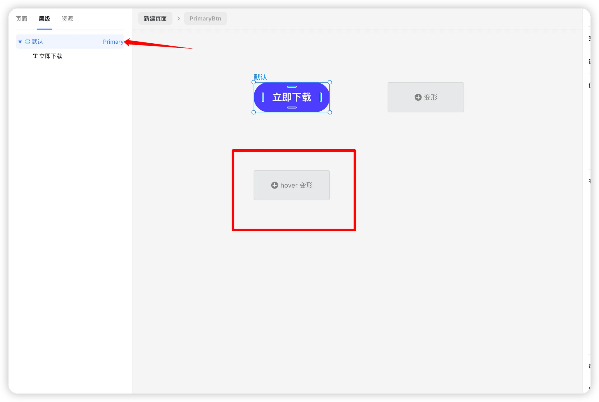
Step 2: Add a Hover Variant
- Inside the component editor, select the root node.
- Click “Add Hover Variant.”
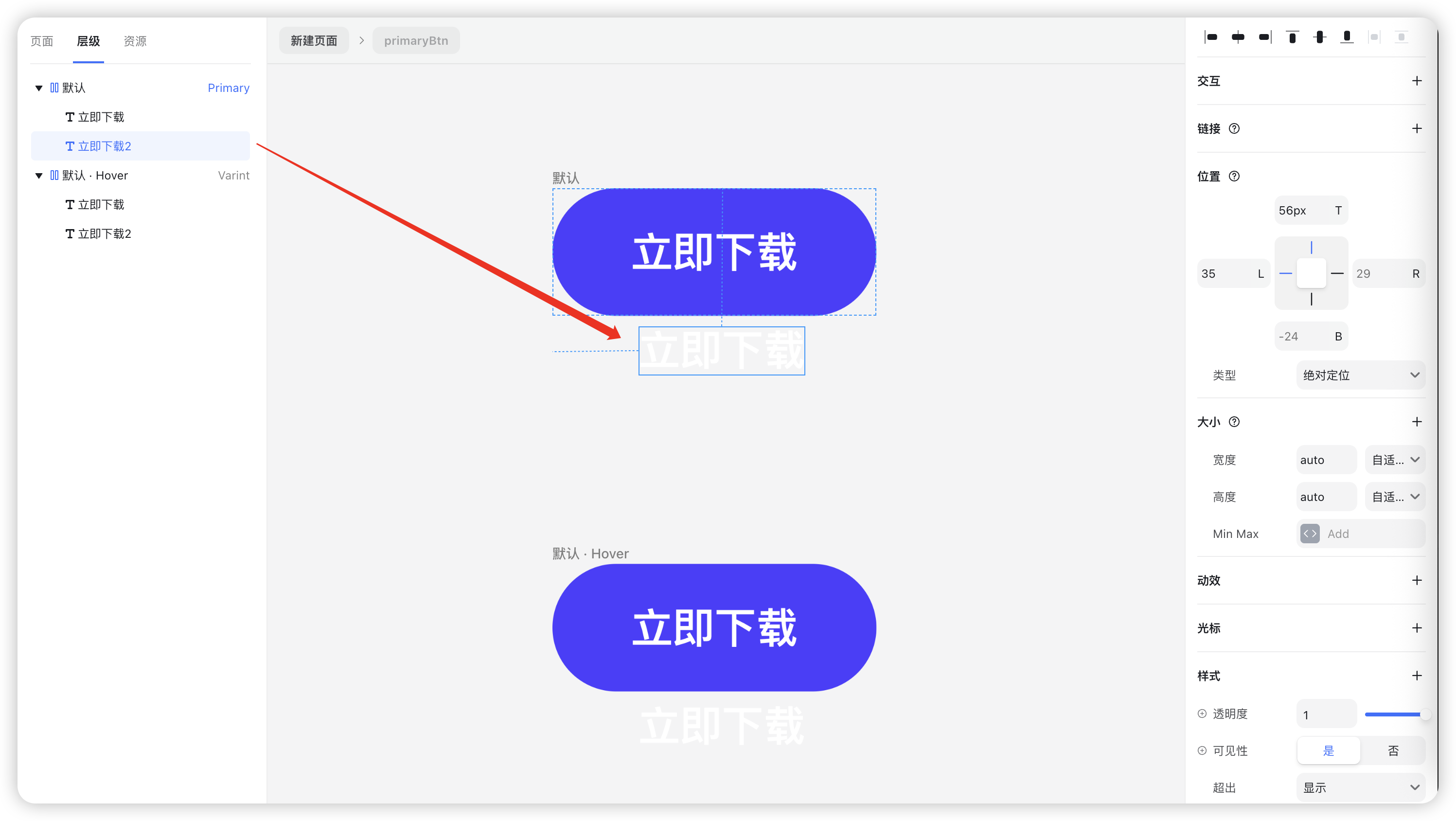
Step 3: Create a Hover Text Element
- Duplicate the text component (Ctrl+D / Cmd+D).
- Set the new text’s position mode to Absolute Positioning.
Adjust the Top value so that the text sits outside the blue background area.
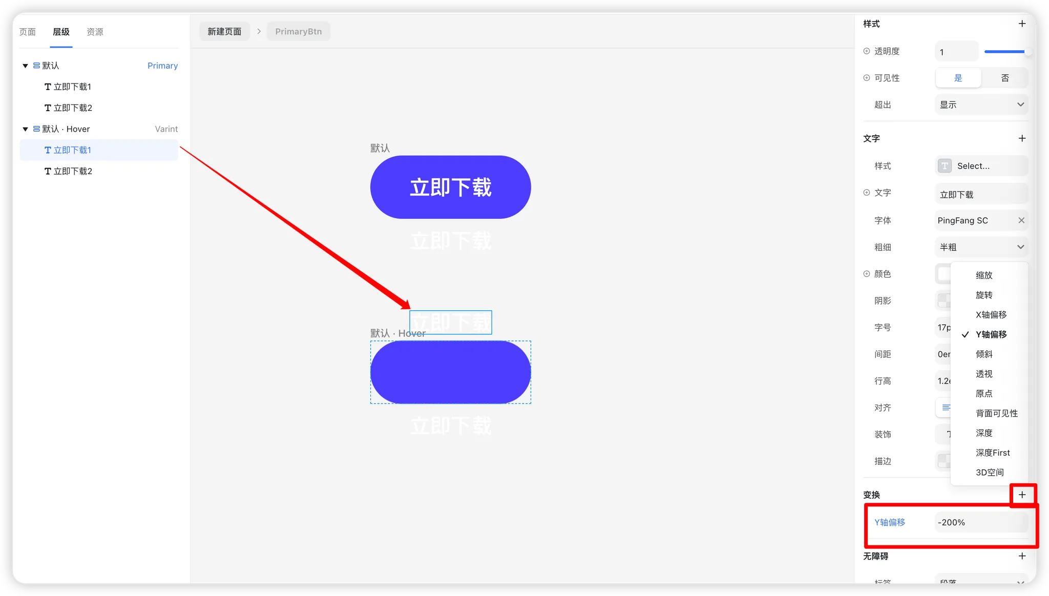
Step 4: Define the Hover Animation
- Select the text element inside the Hover variant.
- In the right-hand panel, click “+ Add Property.”
- Choose Y-axis Offset.
- Set the value to 200%.
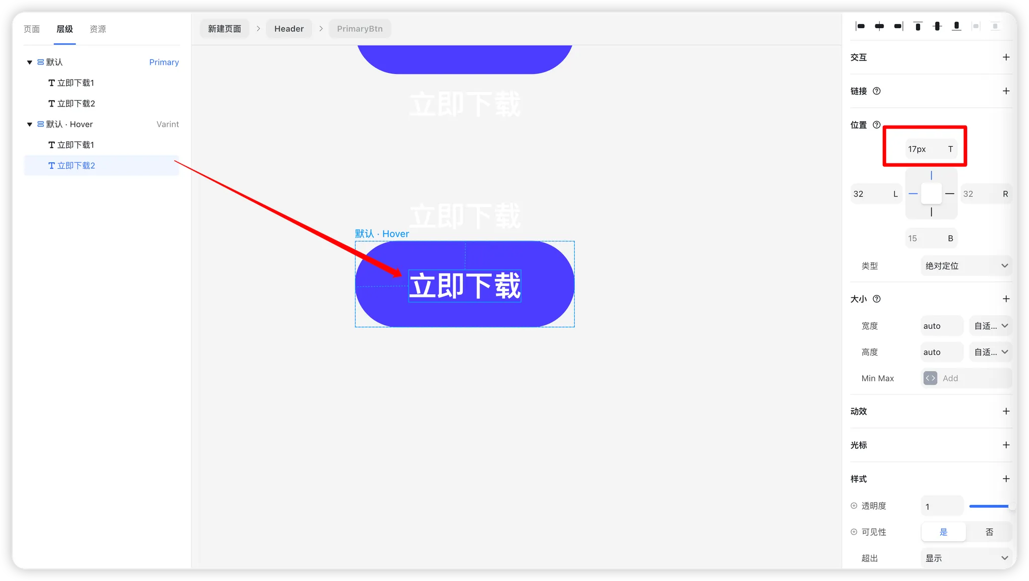
Step 5: Fine-Tune Text Position
- Select the lower text component.
- Adjust its Top value to 17px.
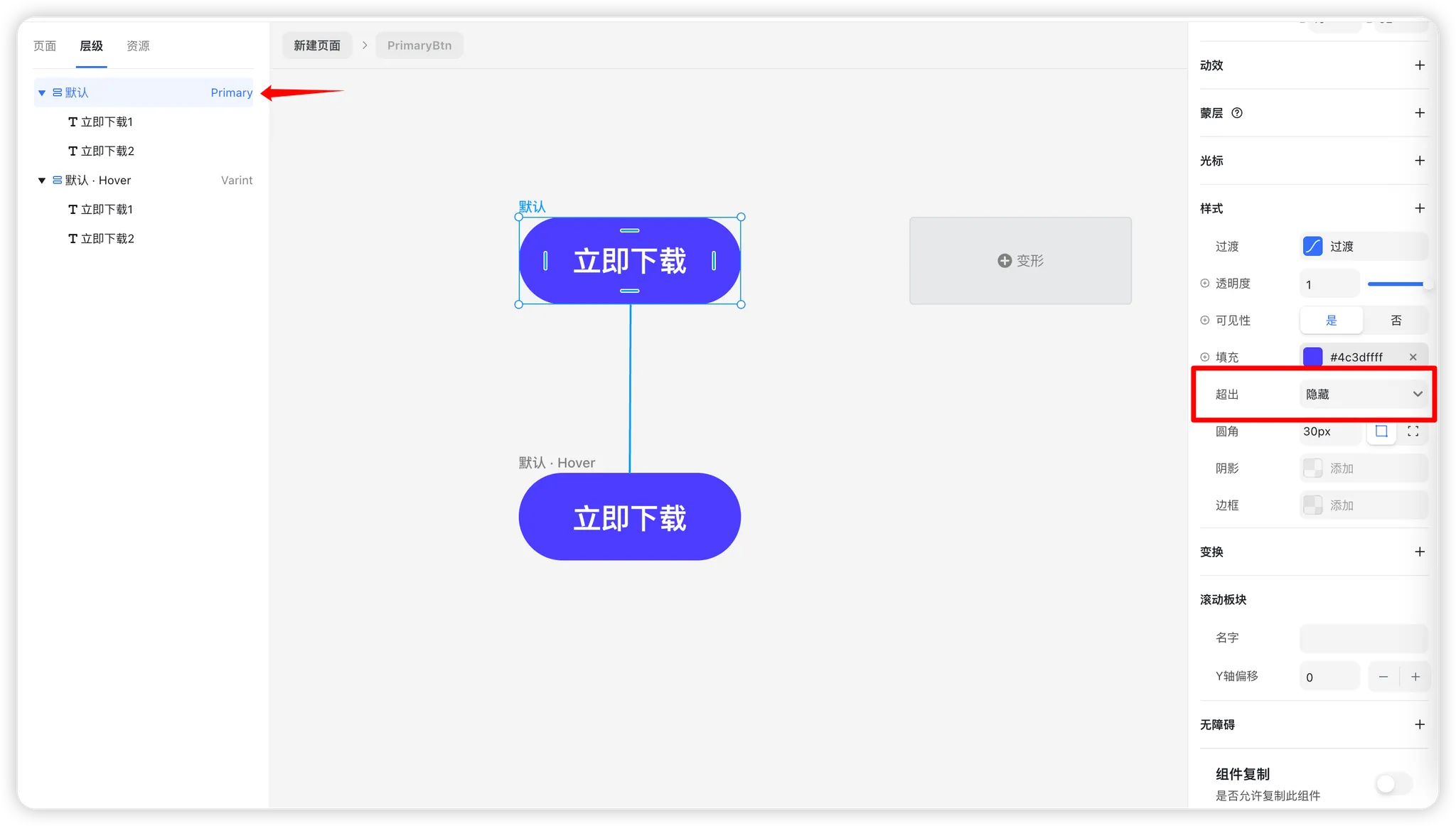
Step 6: Hide Overflow Content
- Select the Default root component.
- In the properties panel, locate the Overflow setting.
- Set it to Hidden.
Step 7: Preview the Effect
You can now preview the hover effect in action. When users hover over the button, the text smoothly transitions with an animated slide.
Advanced Notes
Once you’ve mastered button hover effects, you can apply the same principles to other components such as cards, navigation items, and more.
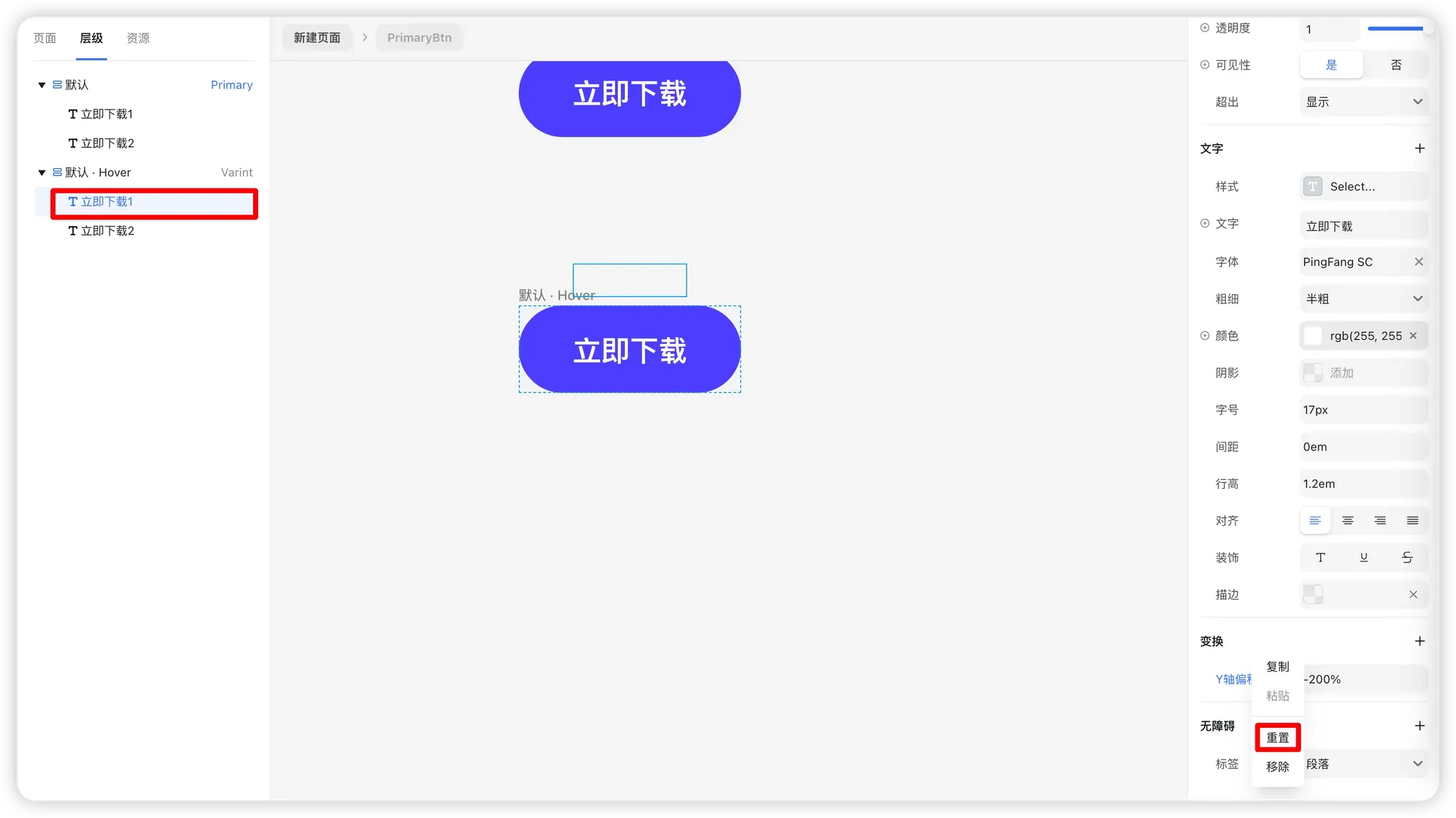
Component Property Inheritance Rules
- Unmodified properties: Attributes from the Primary component are inherited by all variants (e.g., Overflow: Hidden).
- Modified properties: If a property is changed in a variant, updates in the Primary component won’t override it.
- Reset properties: Properties that differ from the Primary show a blue indicator. Right-click the property and select “Reset” to restore consistency.