.png?w=3072&fmt=webp)
/
3 Guidelines for Responsive Figma Layouts
Last updated:
This guide helps designers structure Figma files so they can be converted into responsive web code—or imported into site builders like Creght, Framer, and Webflow—more quickly and accurately.
Why make your designs responsive?
When a design has responsive “DNA”:
- Development fidelity increases by over 40% (Figma 2023 survey)
- Time to adapt across devices drops by 60%
- Seamless handoff to major site builders (Creght / Webflow / Framer)
Comparison
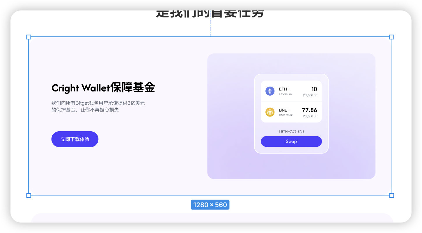
Non-responsive file imported into Creght vs Responsive file imported into Creght
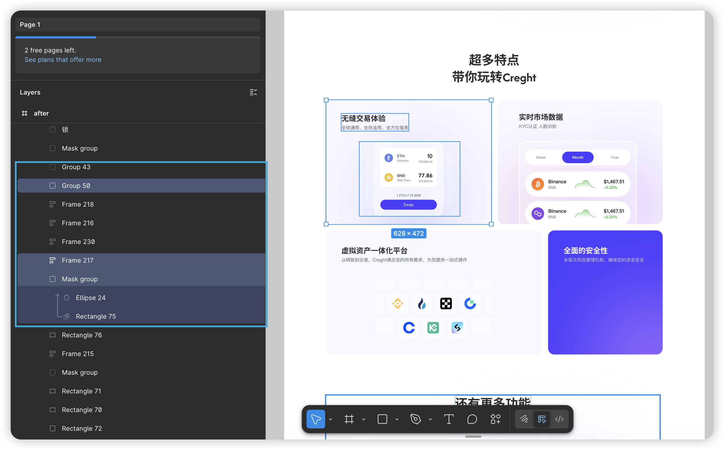
Non-responsive import — result:
(See image)
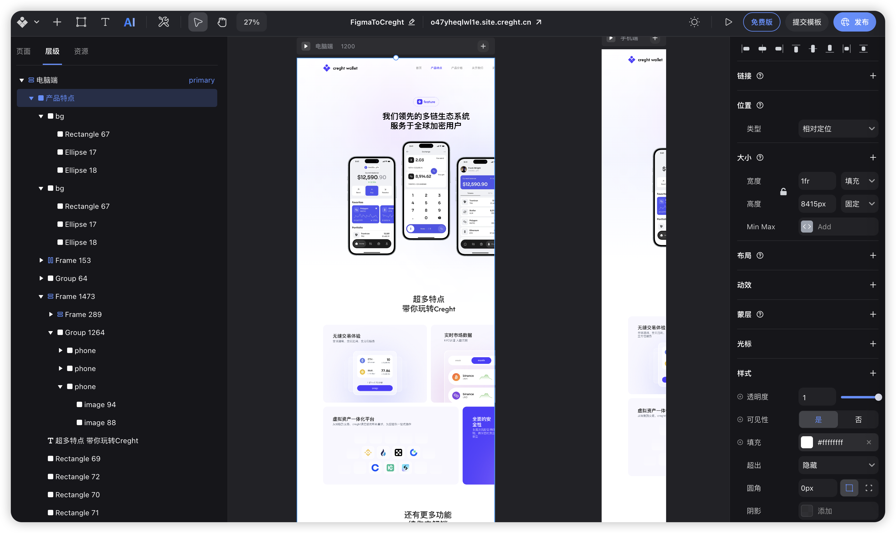
Main issues:
- ❌ Lots of rebuilding required: ~90% of layouts need manual fixes
- ❌ Hard to adapt to breakpoints: every breakpoint requires separate adjustments
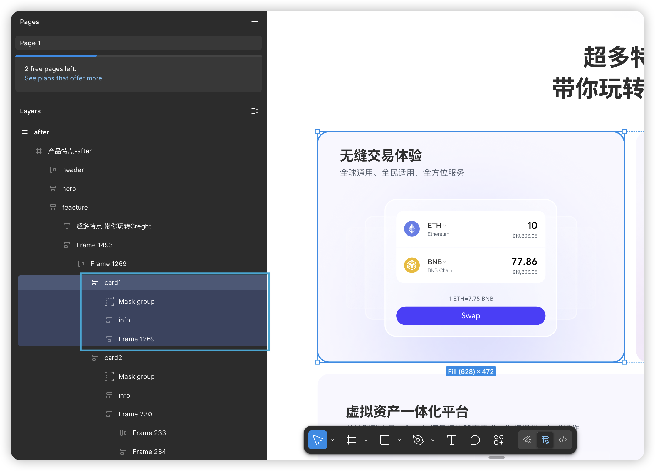
Responsive import — result:
Key benefits:
- ✅ High completion on import: over 85% of layout completed with high fidelity
- ✅ Only minor tweaks needed: spacing, a few fixed sizes, and type scale adjustments
- ✅ Fast breakpoint adaptation: layouts require only small adjustments per breakpoint
- ✅ Design consistency preserved: inherits responsive rules from the design system
How to create truly responsive Figma files
We summarize three core principles to help you produce responsive designs.
Core 1 — Divide the page into clear sections
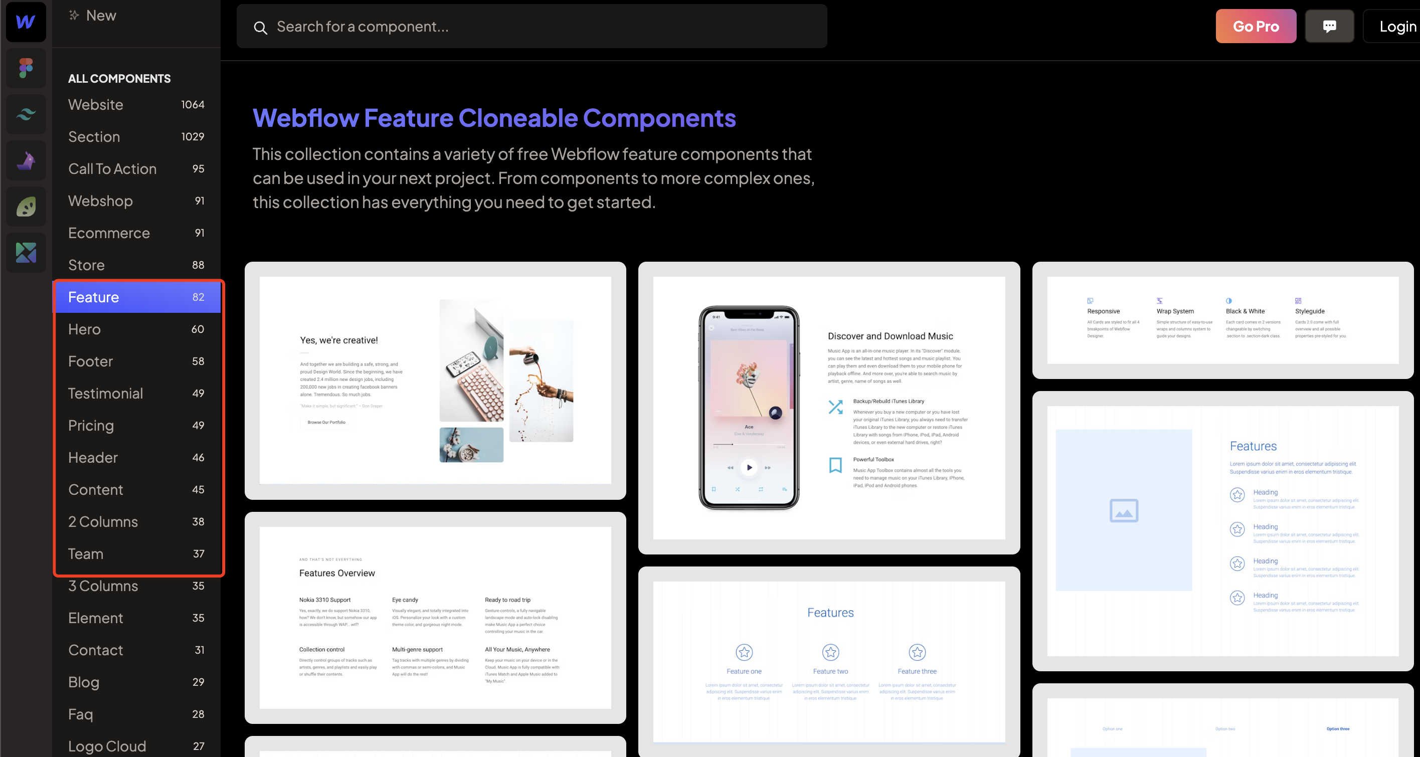
Web pages should be built from logically distinct content sections (e.g., Hero, About, Product grid, Testimonials). It’s important to follow the sectioning conventions used by major UI libraries.
Example: Webflow’s UI library .
❌ Poor sectioning: elements mixed together, unclear boundaries, hard to separate.
✅ Good sectioning: independent sections, clear hierarchy.
Benefits of clear sectioning:
- Easy management: move, duplicate, or delete whole sections quickly.
- Clear structure: the file’s content and hierarchy are immediately understandable.
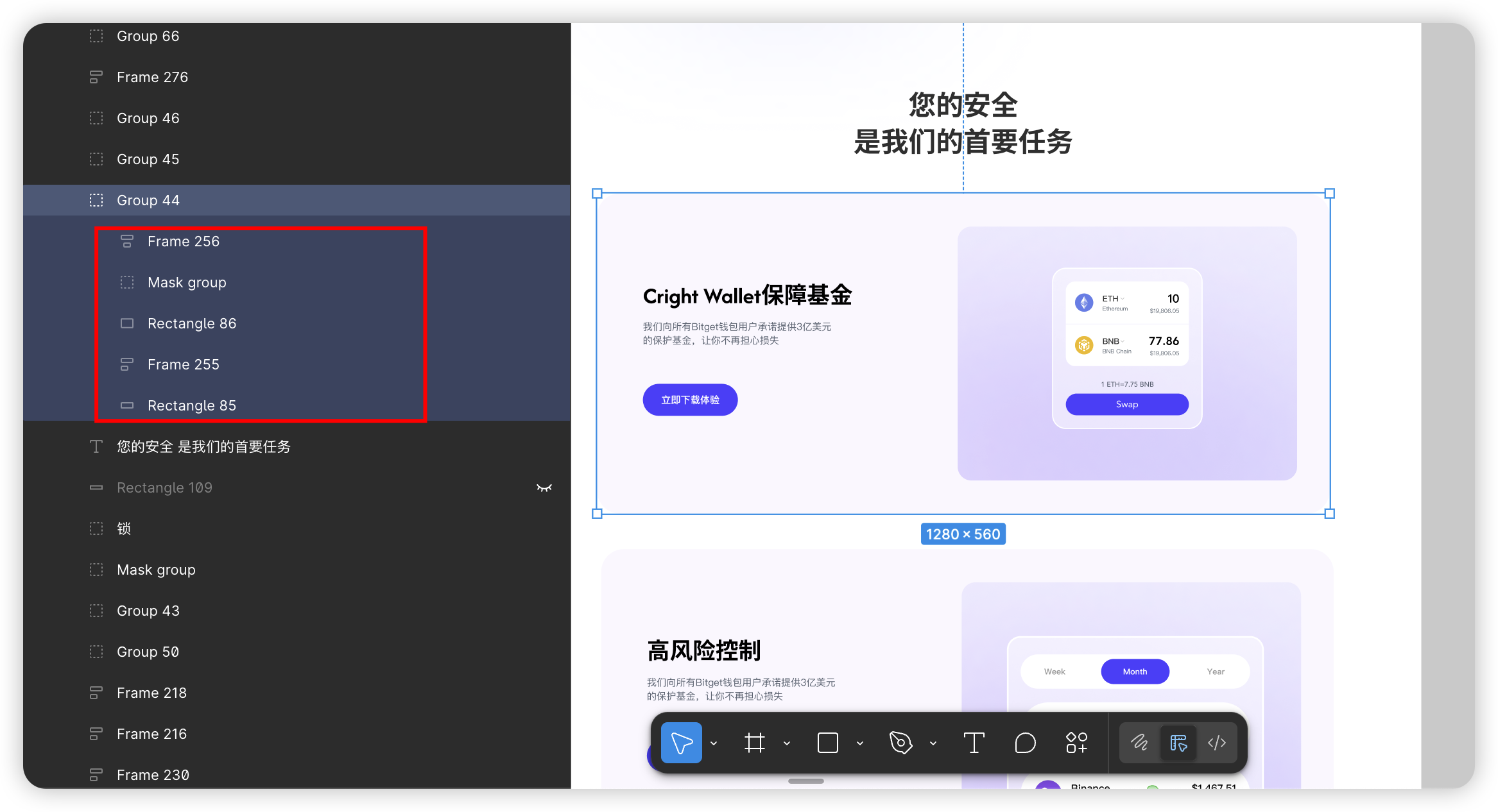
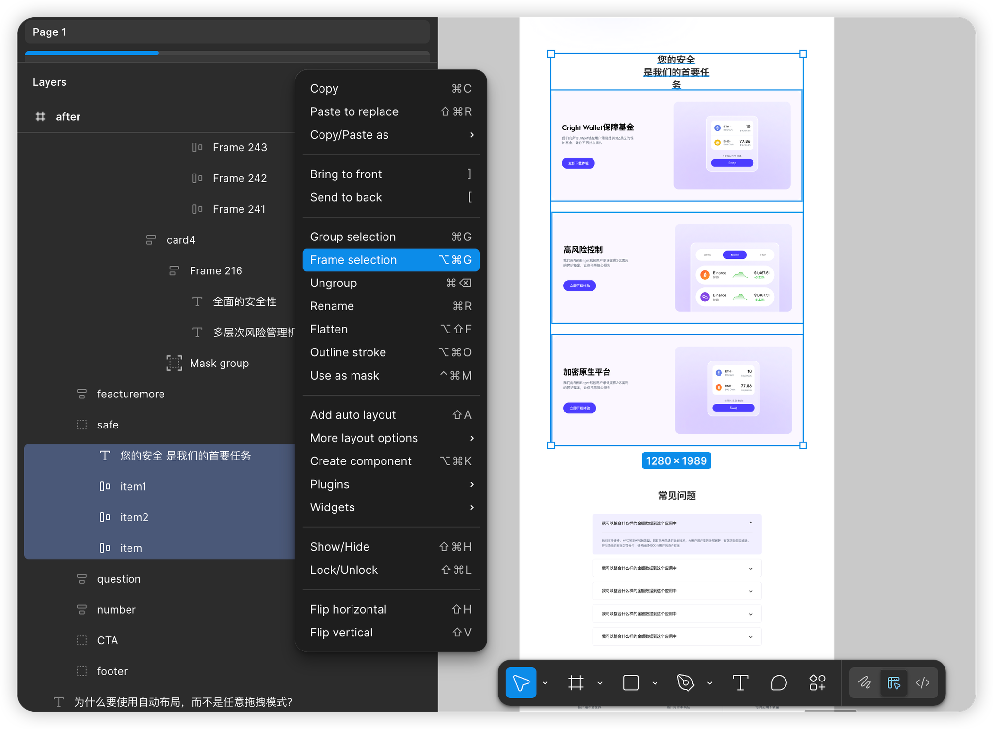
Core 2 — Group elements effectively
Within each section, group related elements (for example, everything in a card should be a single group).
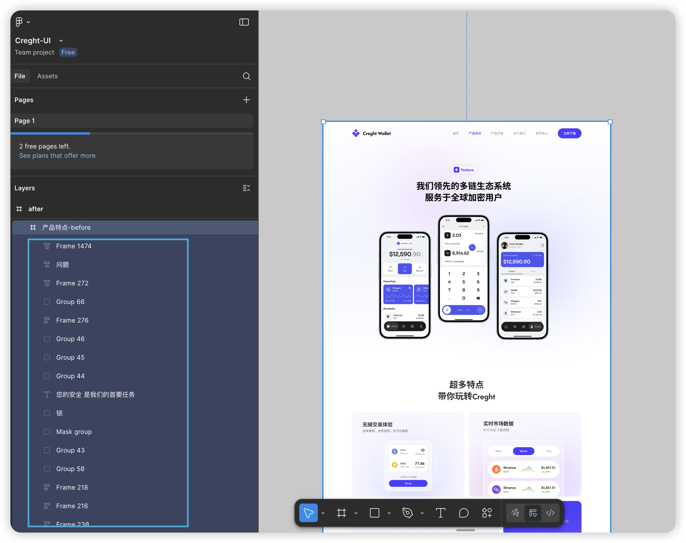
❌ Bad grouping: messy layer structure; component parts scattered; responsive adjustments become difficult.
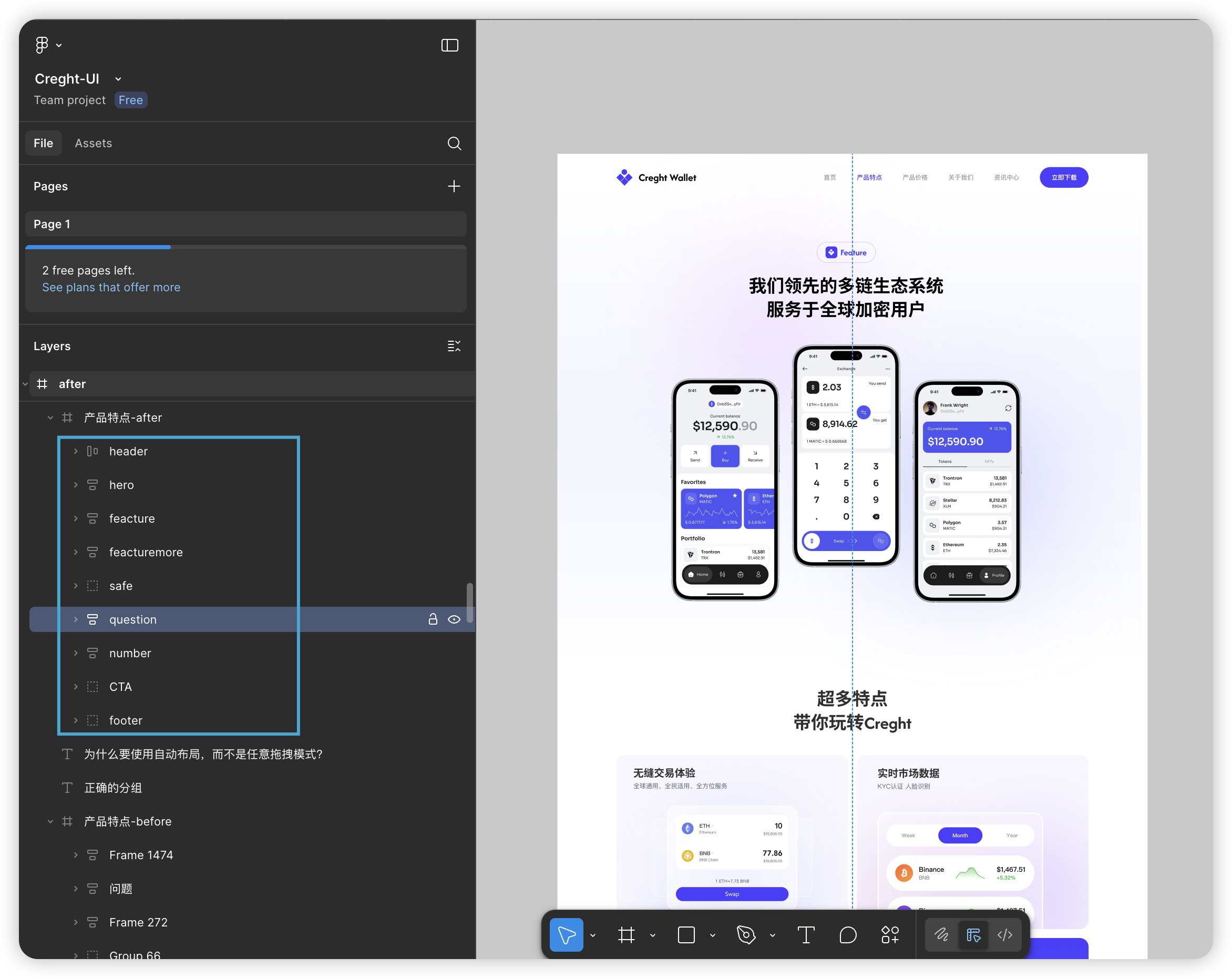
✅ Good grouping: clean layers; easier responsive adjustments.
Why good grouping matters:
- Clear structure — layers reflect intent.
- Easier management — make global changes (background, spacing) faster.
Grouping principles to follow:
- Responsive-friendly groups: structure groups so desktop→mobile conversions require minimal changes.
- Layers should reflect the layout: someone should understand layout intent from layers alone.
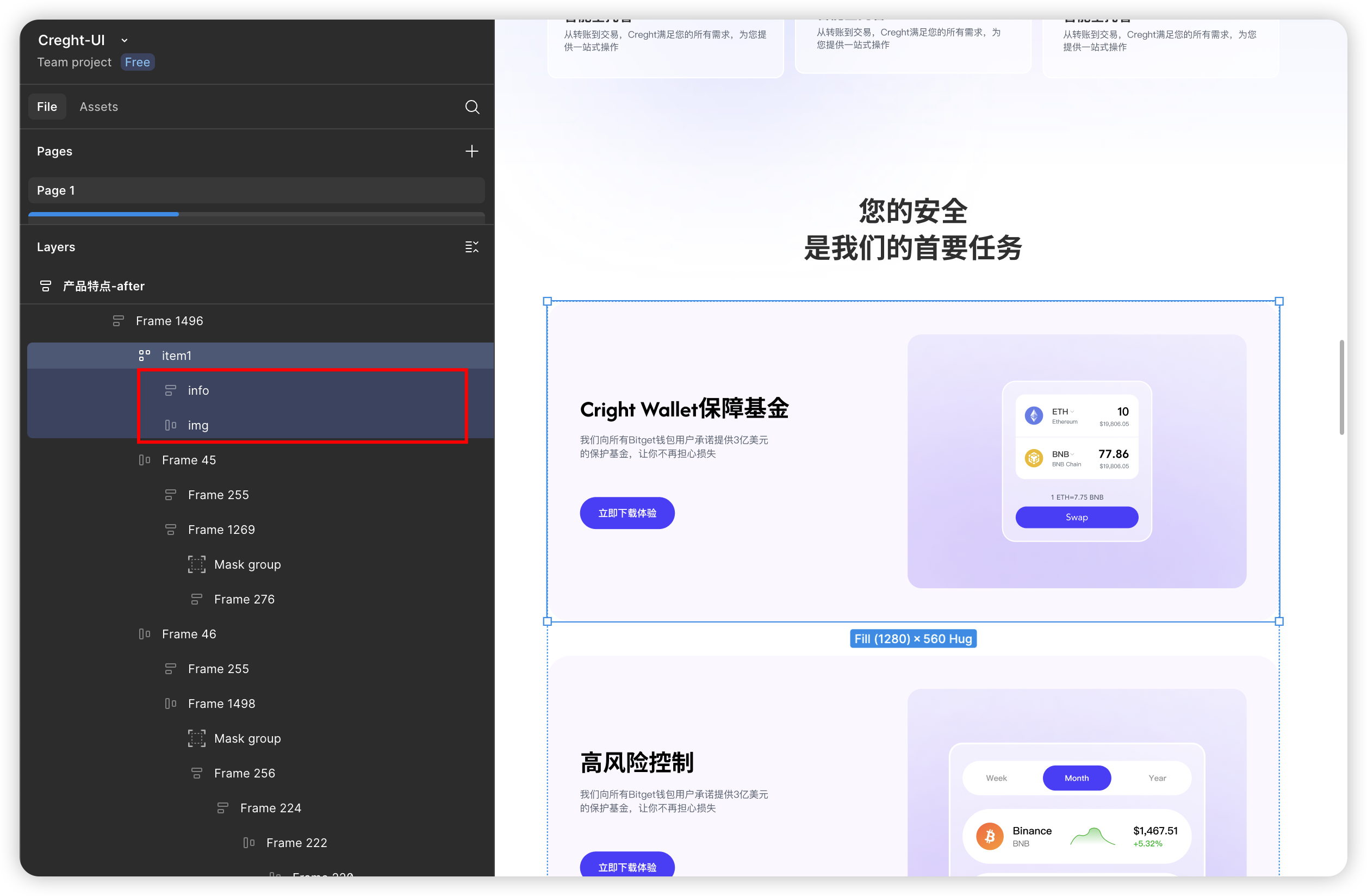
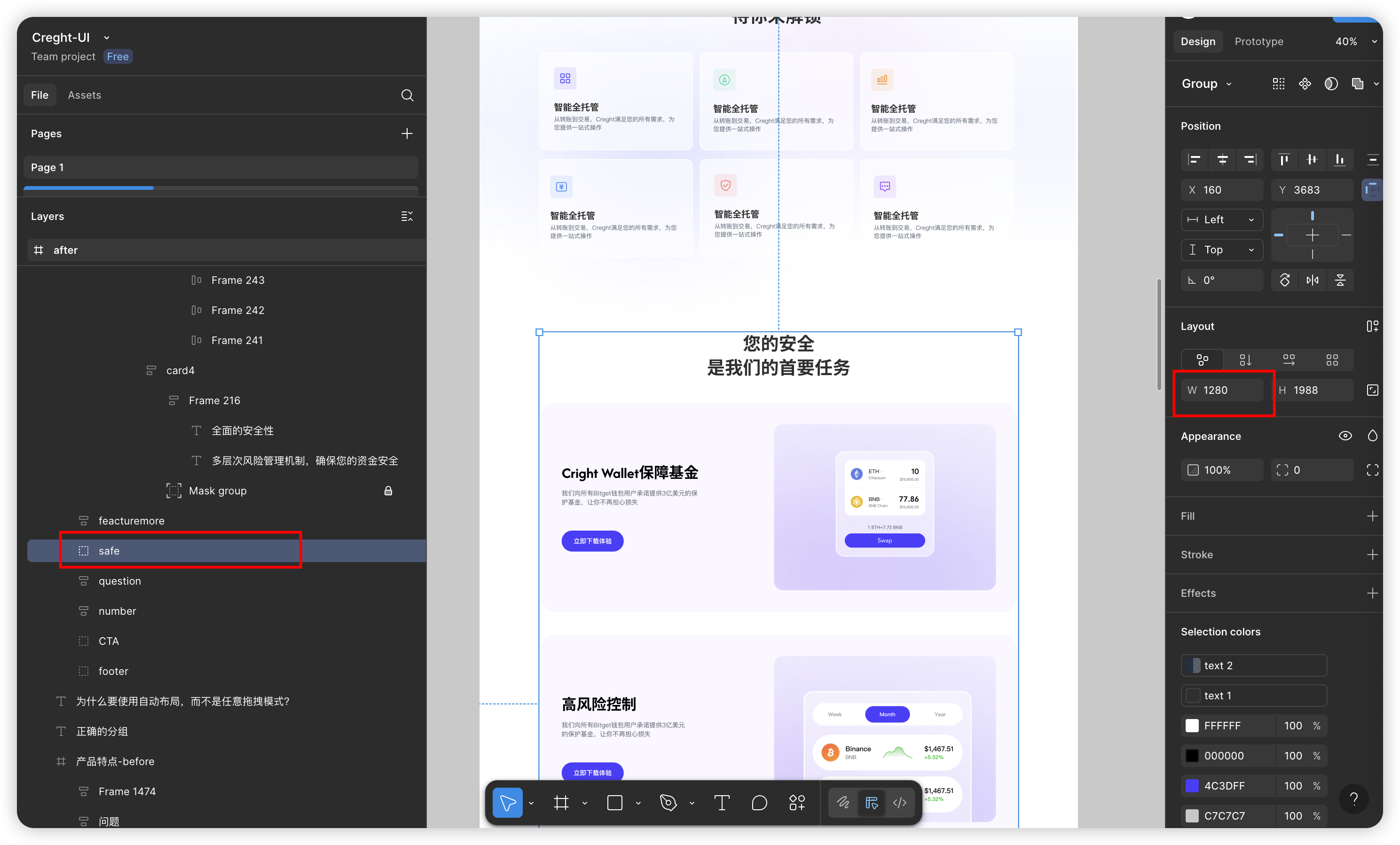
Case study: Problem Structure:
- Problem 1: Difficulty with responsive adjustments.
- Problem 2: Layer structure does not clearly convey the layout intent, which is not conducive to maintenance and front-end restoration.
- Improved structure:
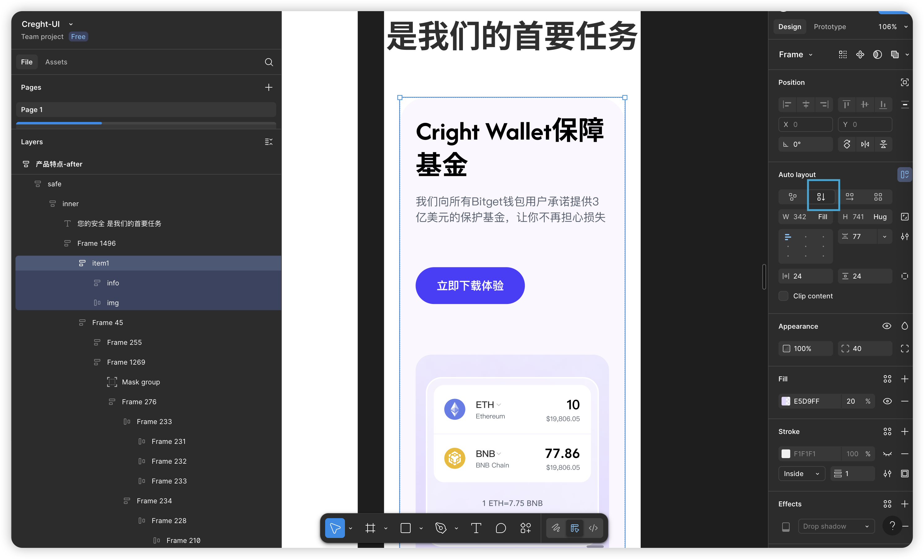
Core 3 — Favor Auto Layout
Wherever possible, use Figma’s Auto Layout inside groups and sections.
Auto Layout is essential for responsive design — major advantages:
- Efficient responsiveness: changing simple properties (direction, constraints) adapts layouts to different screens.
- Developer-friendly structure: mirrors front-end concepts (Flexbox / Grid), so developers need less rework.
- Tool compatibility: works well with Creght, Framer, Webflow and Figma→Code plugins.
- Easy maintenance: contents resize automatically when content changes.
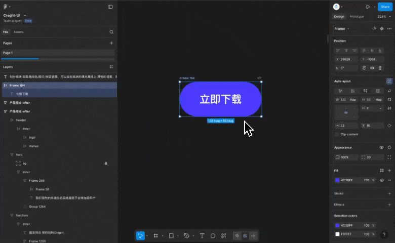
Typical example — converting a card from horizontal (desktop) to vertical (mobile):
After applying Auto Layout, switch the direction from horizontal (→) to vertical (↓) and the card rearranges itself.
Auto Layout property guidance: Prefer Fill or Hug over fixed sizes.
Fill: element expands to fill available space.Hug: element sizes to fit its content.
Live demo:
shows container adapting its width to internal changes—no manual width edits needed. This greatly improves efficiency when many elements affect each other.
Exceptions & notes (when to use fixed sizes / Max Width):
Decorative elements: e.g., background decoration layers may need fixed sizes and separate adjustments on mobile((see decorative background example)
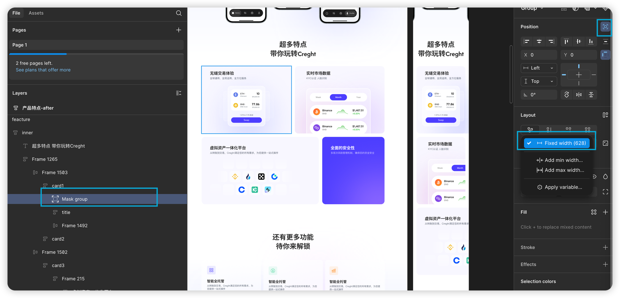
2. Unequal content widths: e.g., if card 3 should be twice as wide as card 4, set fixed widths for those cards; on mobile you’ll need to adjust them.
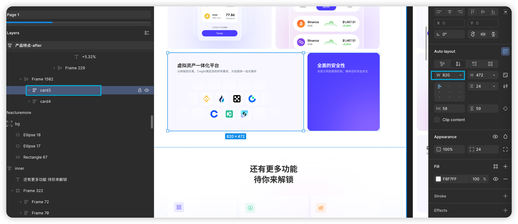
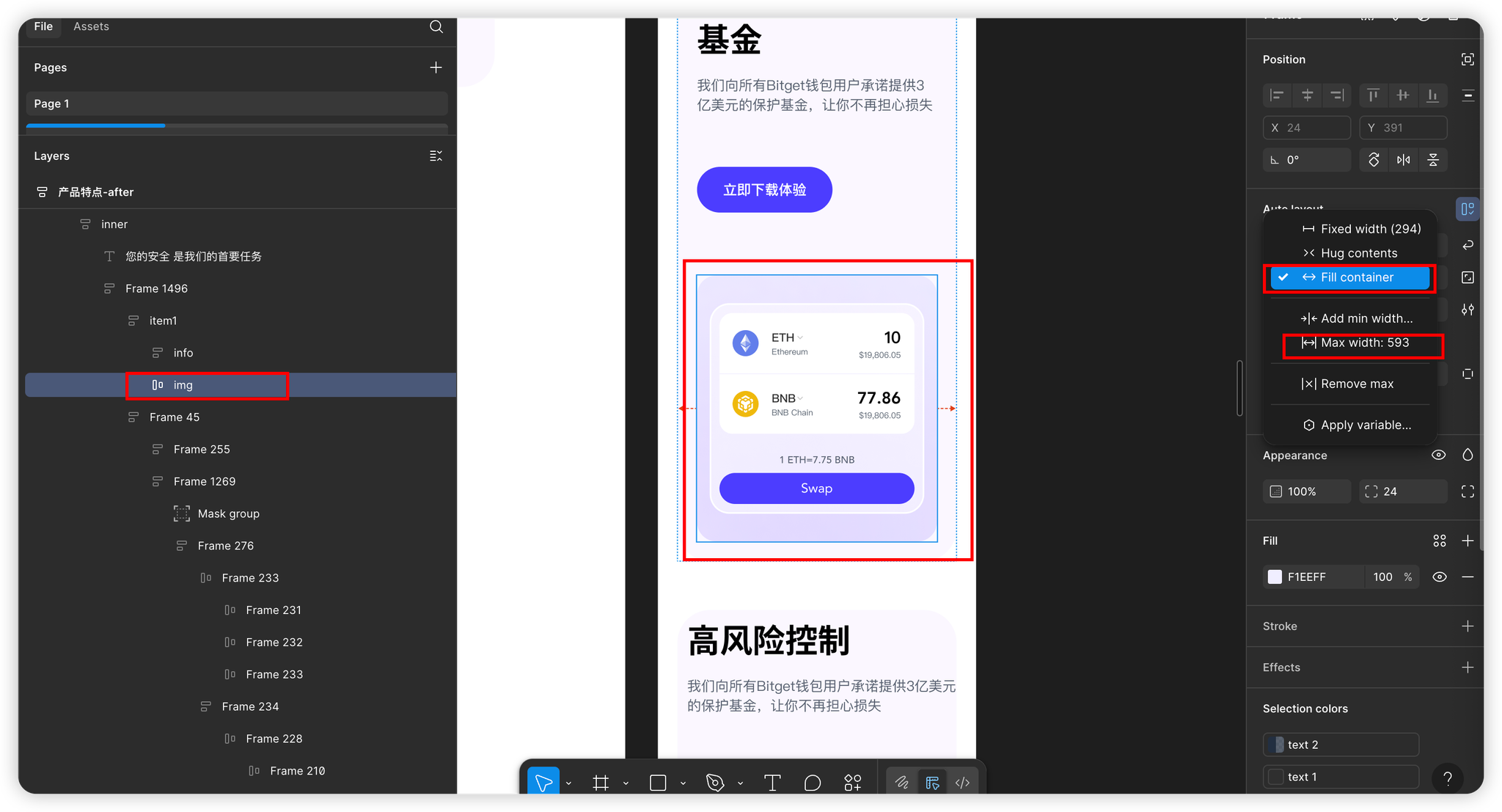
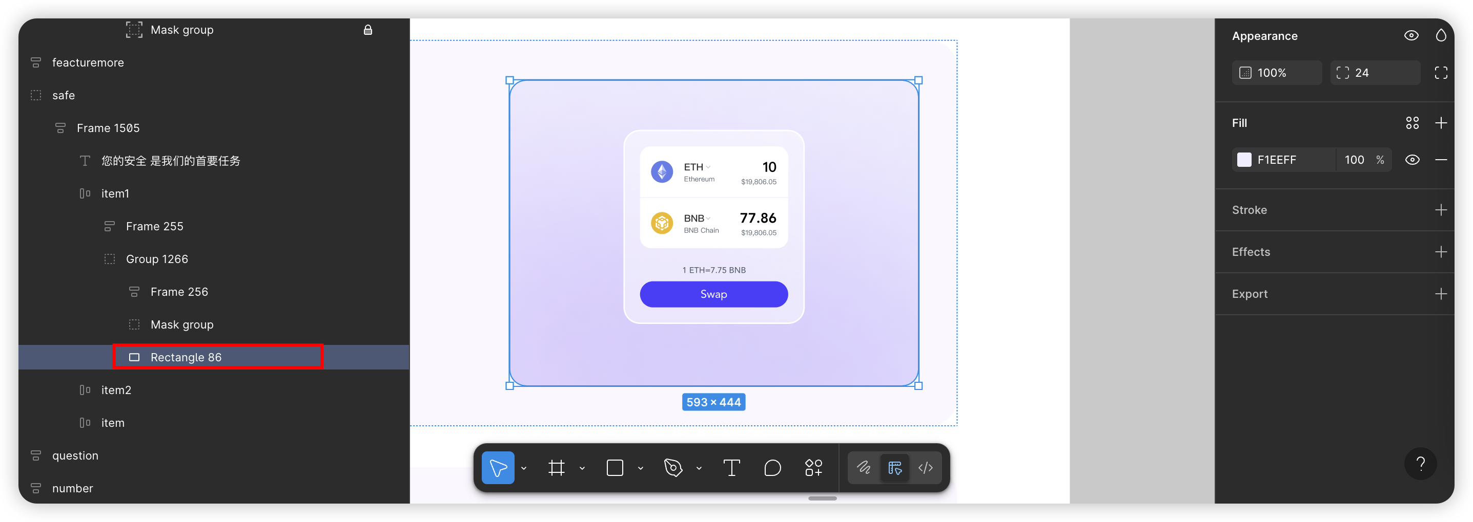
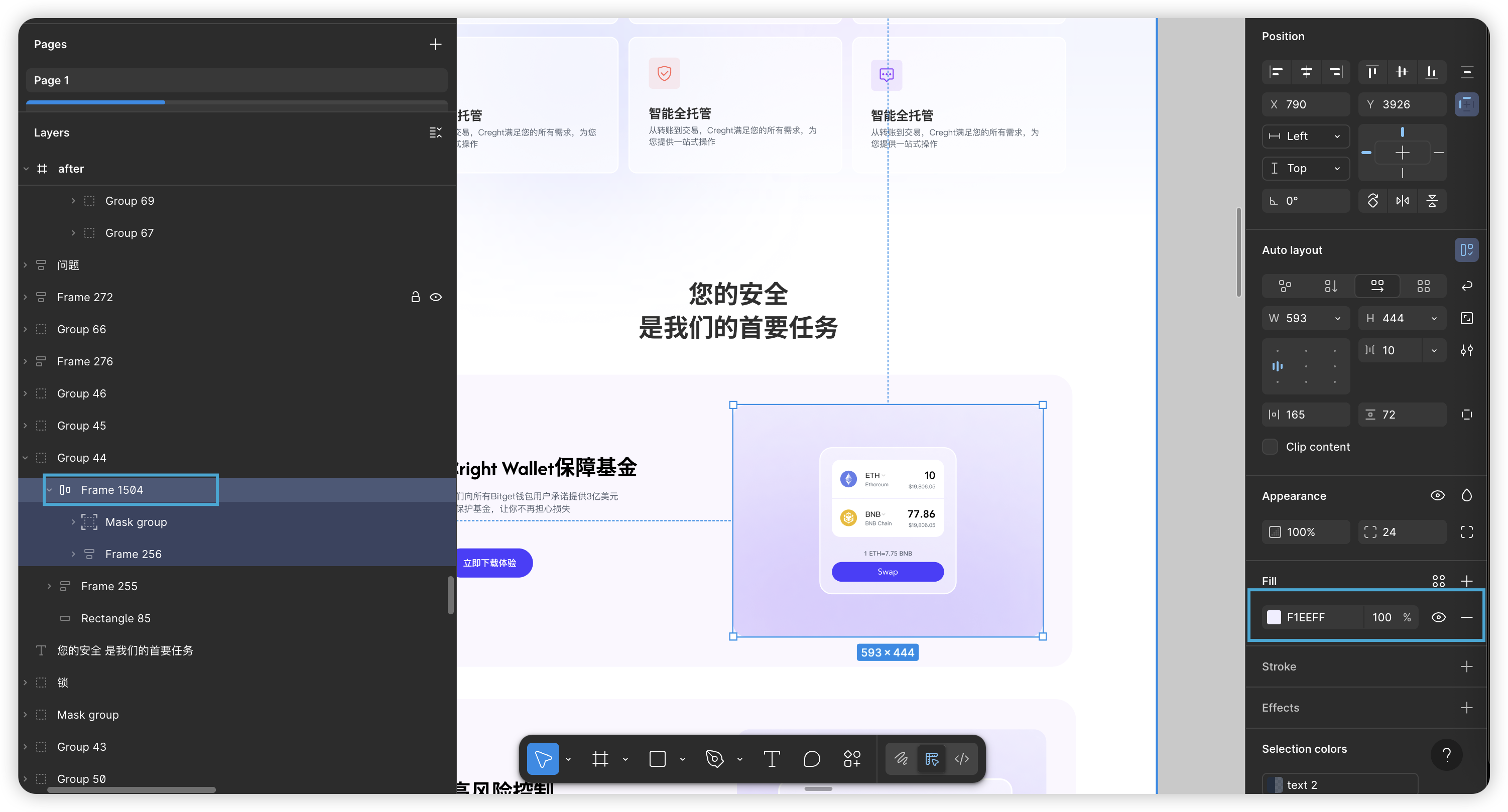
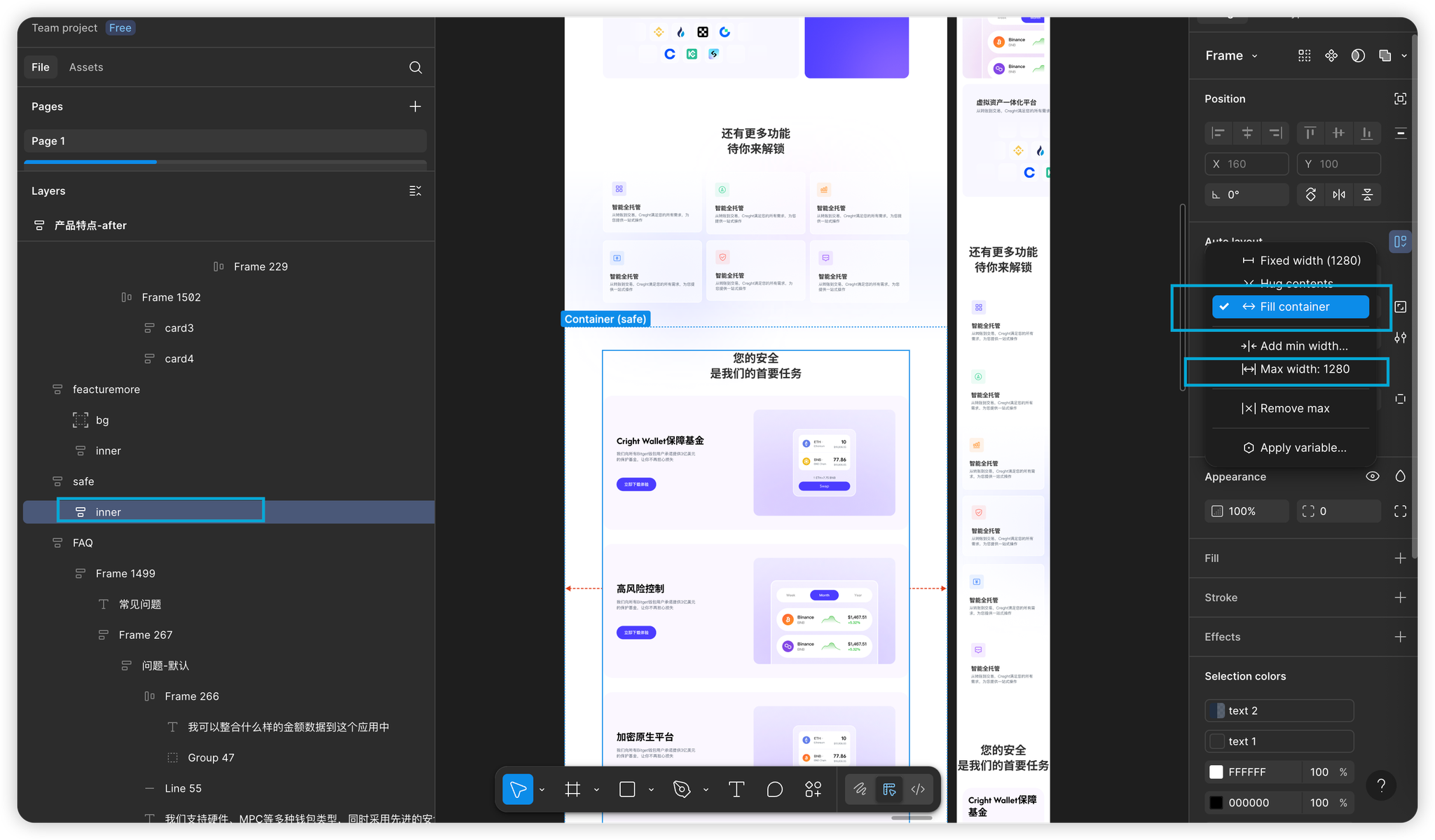
3. Limit a Fill’s max width: e.g., if the right card must stay at 593px, setting it toFillalone will make it fill remaining space. Solutions:
- Option A: set a Fixed width.
Better Option B: set to
Filland addMax width = 593px.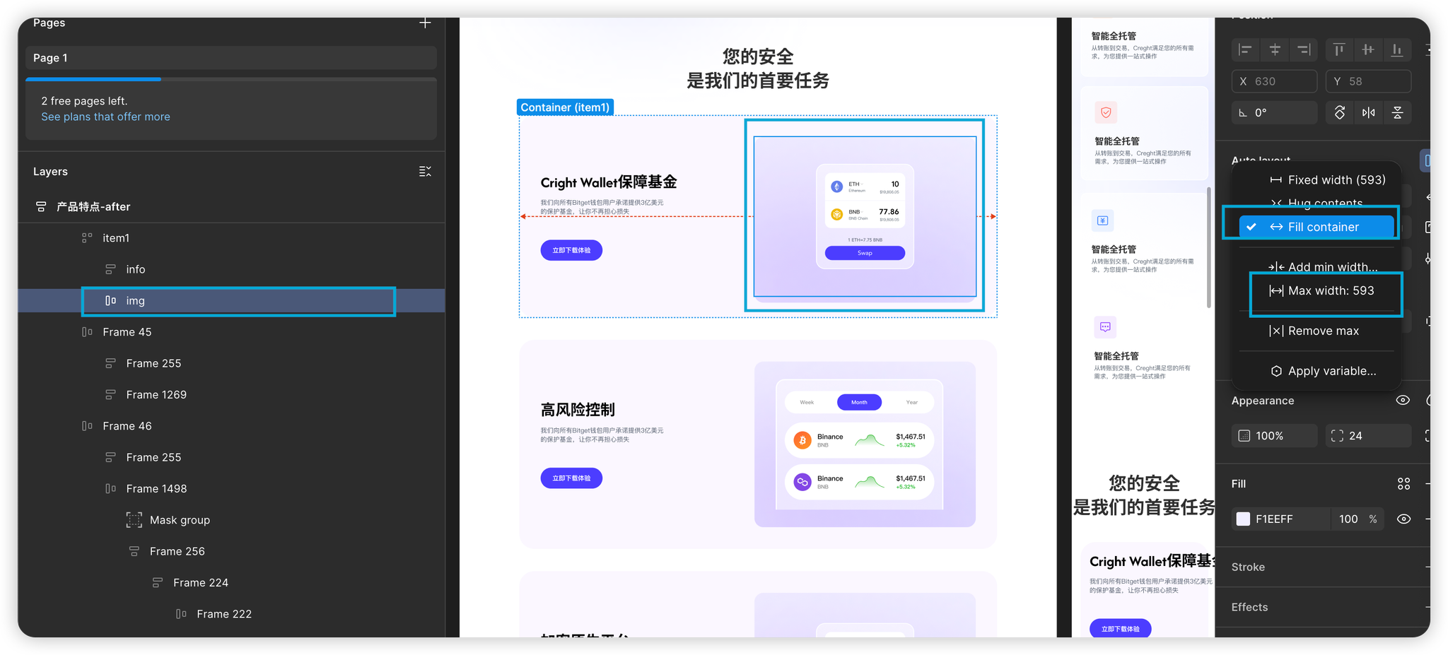
Why B is better: on mobile the width responds automatically and shows well without manual changes.
Best practices for common scenarios
Backgrounds:
Typical approach: using a Frame or rectangle as a background.
- Auto Layout Optimization: when Auto Layout is on, background fill moves to the parent container. Recommendation: apply background color/image/gradient to the container component itself rather than adding an extra background layer—this maps better to front-end patterns.
Spacing & alignment:
Common case: Align navigation items to both ends.
❌ Wrong: use large fixed spacers to force alignment.
✅ Right: use Auto Layout’s “space between” (or set spacing to
Auto). The spacing then adjusts dynamically and keeps the alignment.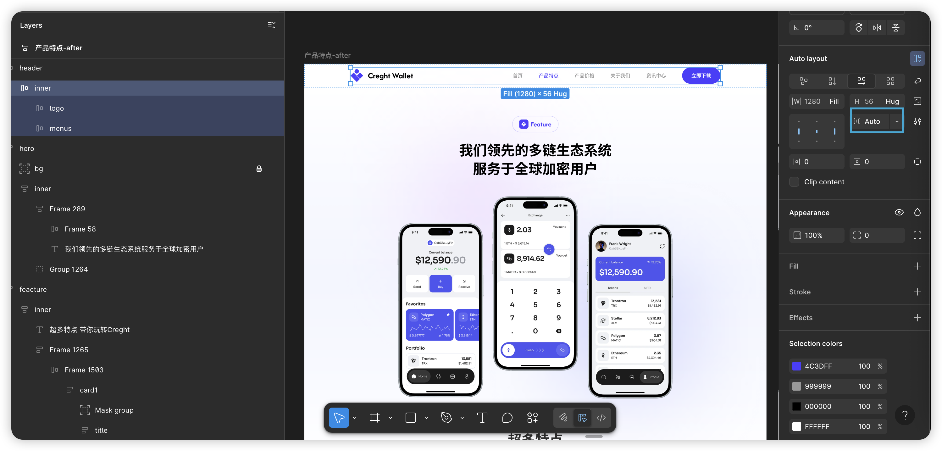
Content width / containers:
Common practice: set the width directly to Fixed.
Recommended Practice:
- Create an inner content container (name it Container or Inner).
2. Set Inner to Auto Layout: width = Fill container, and set a Max width(for example,1280px). Height is usually Hug contents.
3. The outer section (Safe Area) should be Fill. with desired padding.
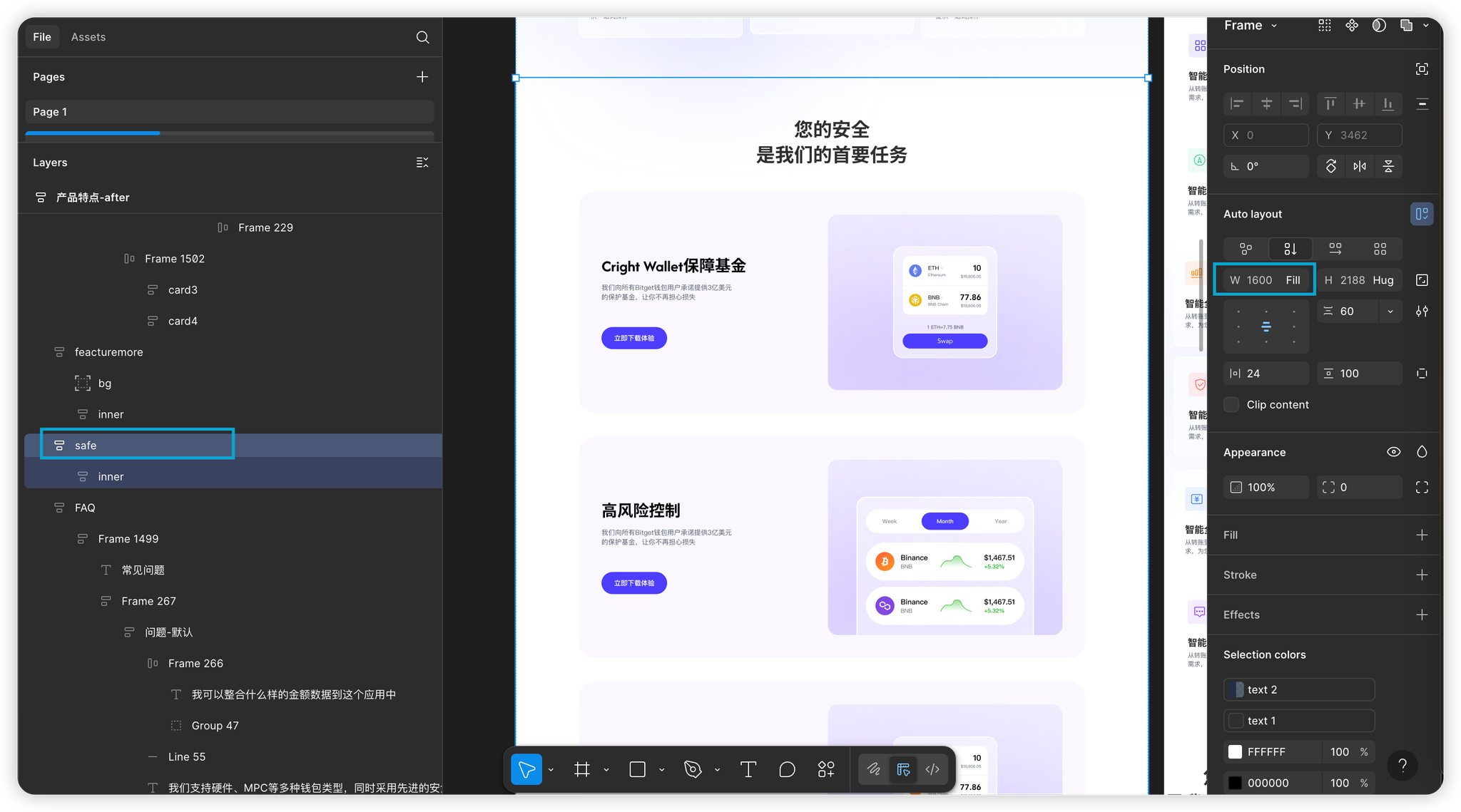
- Result:
- Large screen: on large screens the content centers and respects
Max width - Small screen: on small screens the content width equals screen width minus padding—automatic and predictable behavior.
- Large screen: on large screens the content centers and respects
Real-world case reference
Example Figma files
Non-responsive and responsive example files:
https://www.figma.com/community/file/1529413044116674277
Conclusion
Follow the three core guidelines—clear sectioning, effective grouping, and prioritizing Auto Layout—plus the best practices above, and your Figma files will become structured, highly responsive source files.
This sets the stage for:
- Seamless imports into site builders: Efficiently import into Creght, Framer, Webflow and publish after light tweaks.
- Smoother development handoffs: Significantly reduce front-end rework and speed up delivery quality.
- Better Figma→Code output: Plugins like MCP will generate more accurate and maintainable responsive code.
Next steps: In the follow-up guide we’ll walk through detailed steps for importing optimized responsive Figma files into Creght, highlight pitfalls to watch for, and list the micro-adjustments you’ll typically need to make.