
How to Build a Reusable Collapsible FAQ Panel
Demo Overview
This tutorial walks you through building a clickable, expandable and collapsible FAQ panel component from scratch. You will also turn it into a reusable component structure suitable for FAQs, help centers, and similar use cases.
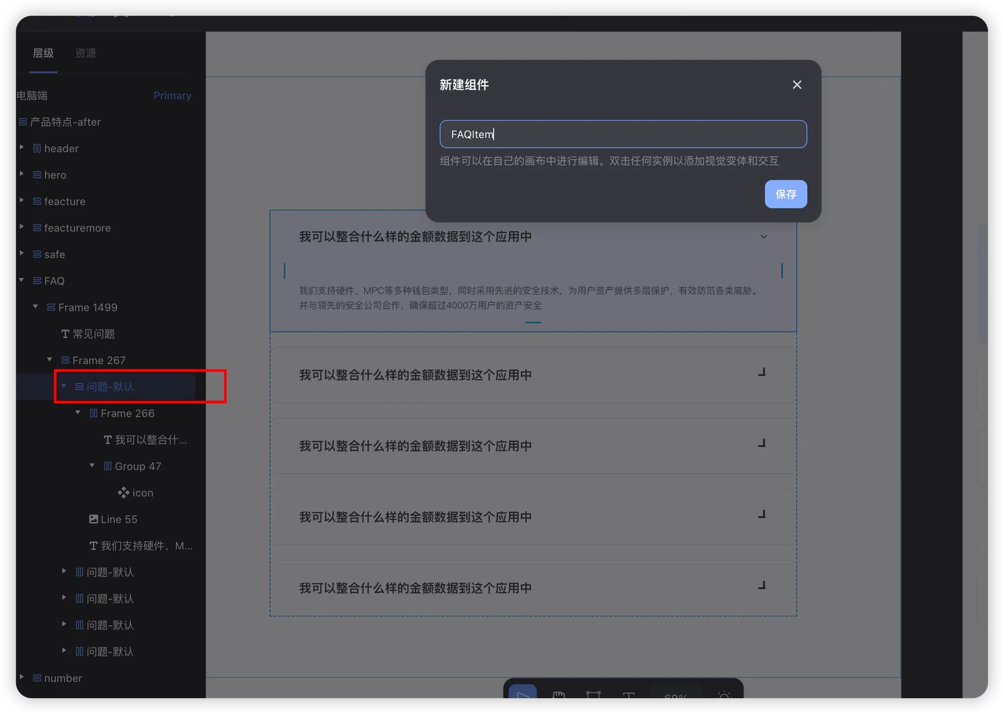
Step 1: Create the Component
- Select the layer that contains the item.
- Right-click, create a component, and name it
FAQItem.
As shown below:
Step 2: Set Up Component Variants (Collapsed / Expanded)
1. Adjust the Base Component Structure
- Select the outermost component.
- Set its height to Auto.
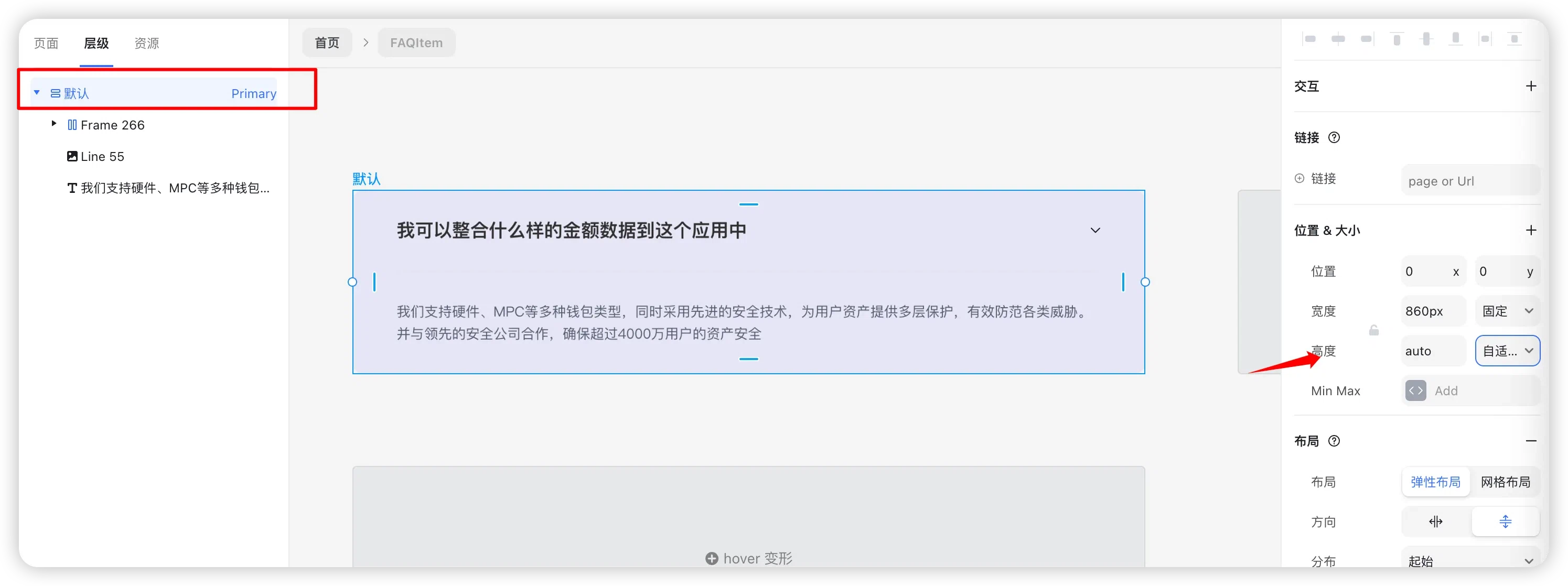
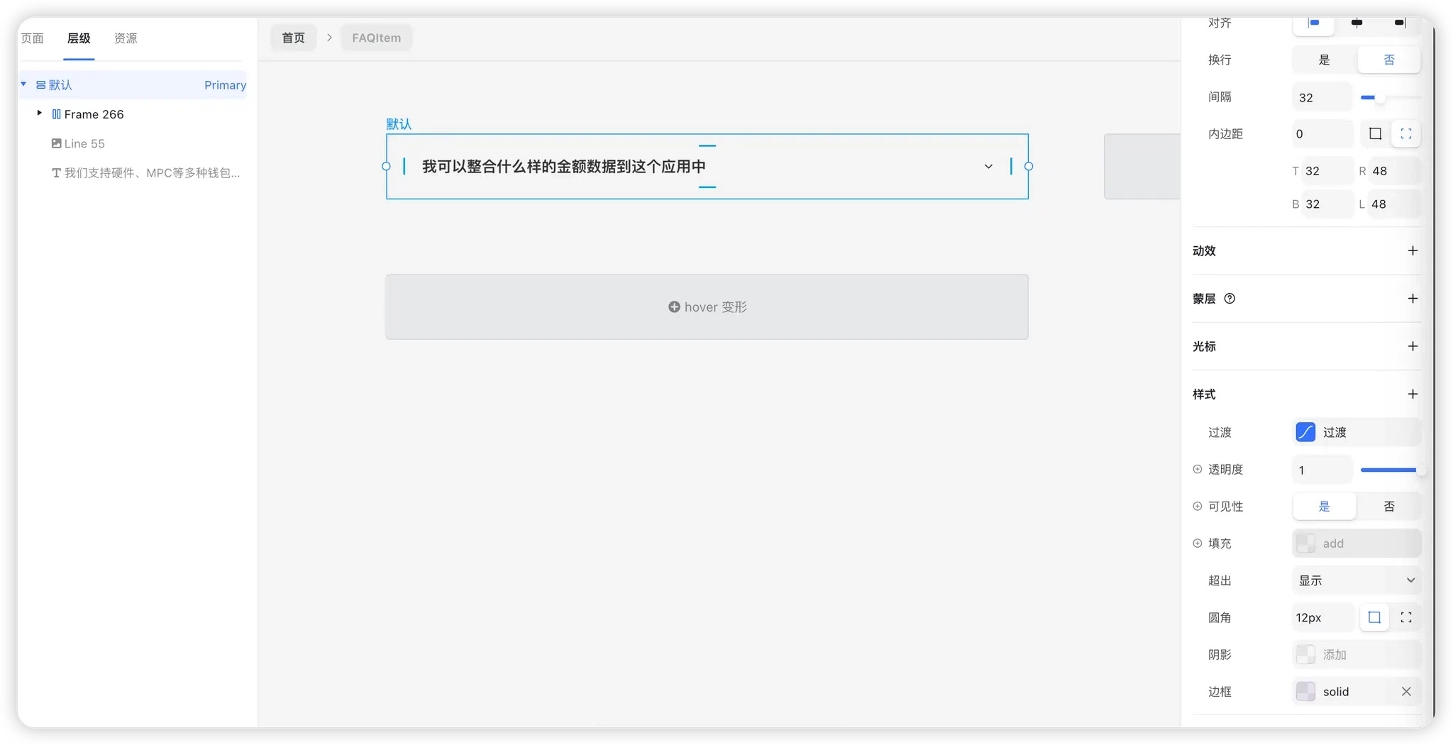
2. Configure the Default Variant (Collapsed State)
In the Default variant:
- Set the visibility of the answer text and divider to Off.
- Remove the background style from the root component.
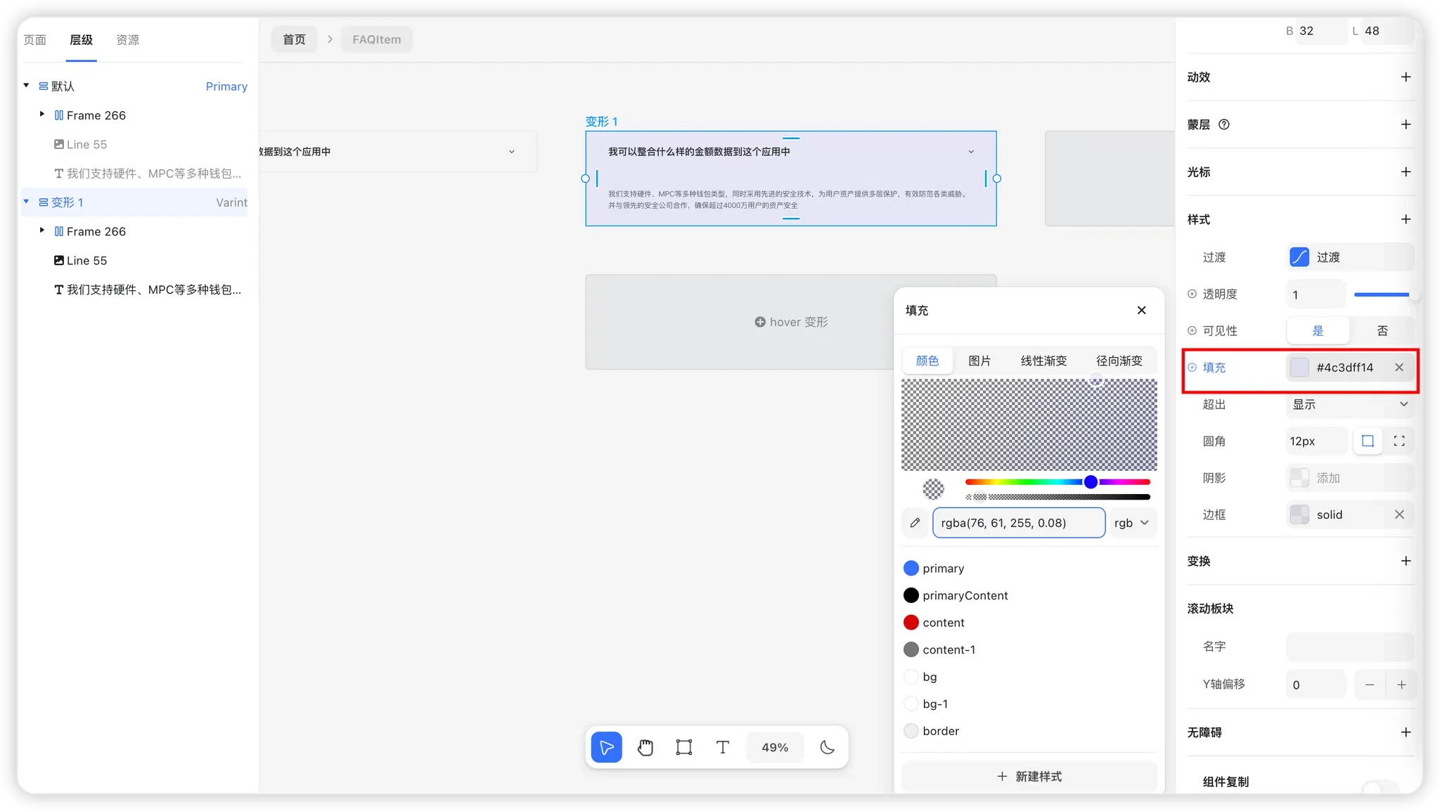
3. Add an Expanded Variant
Add a new component variant.
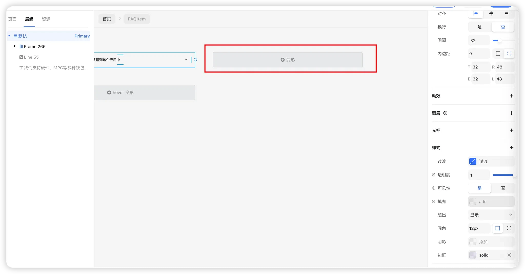
- In Variant 1:
- Set the visibility of the answer text and divider to On.
Add a light purple background to the component.
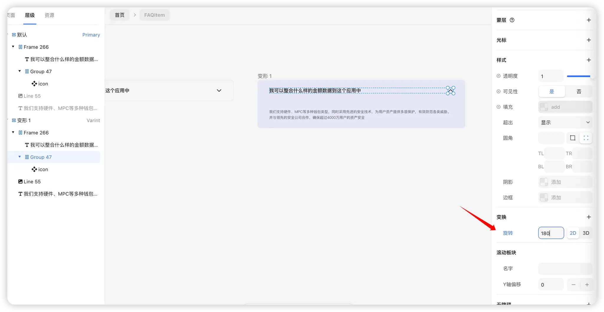
Select the arrow icon and rotate it 180° to indicate the expanded state.
Step 3: Add Interaction Logic
1. Collapsed → Expanded
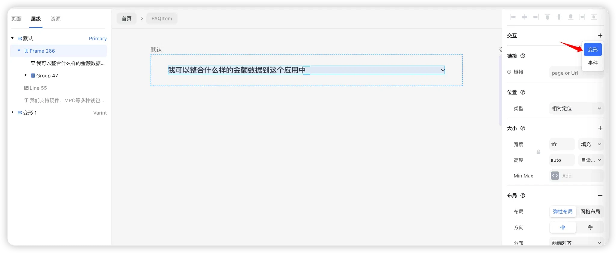
- In the Default variant, select the title group.
Click the “+” under Interactions in the right panel and choose Variant.
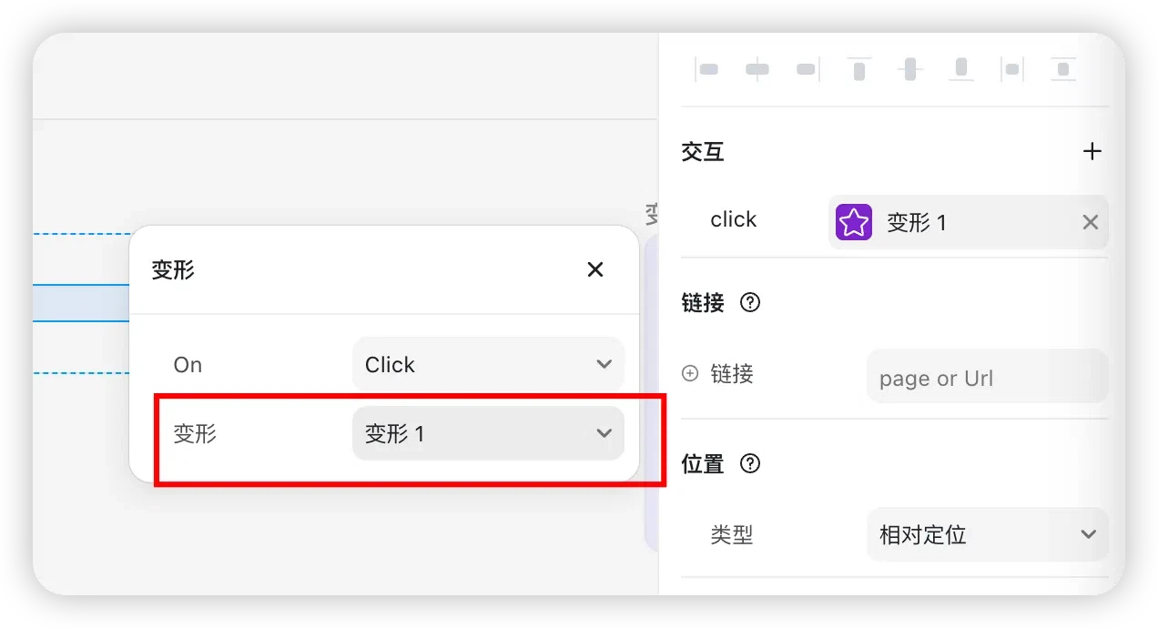
- Choose Click as the trigger.
Set the target variant to Variant 1.
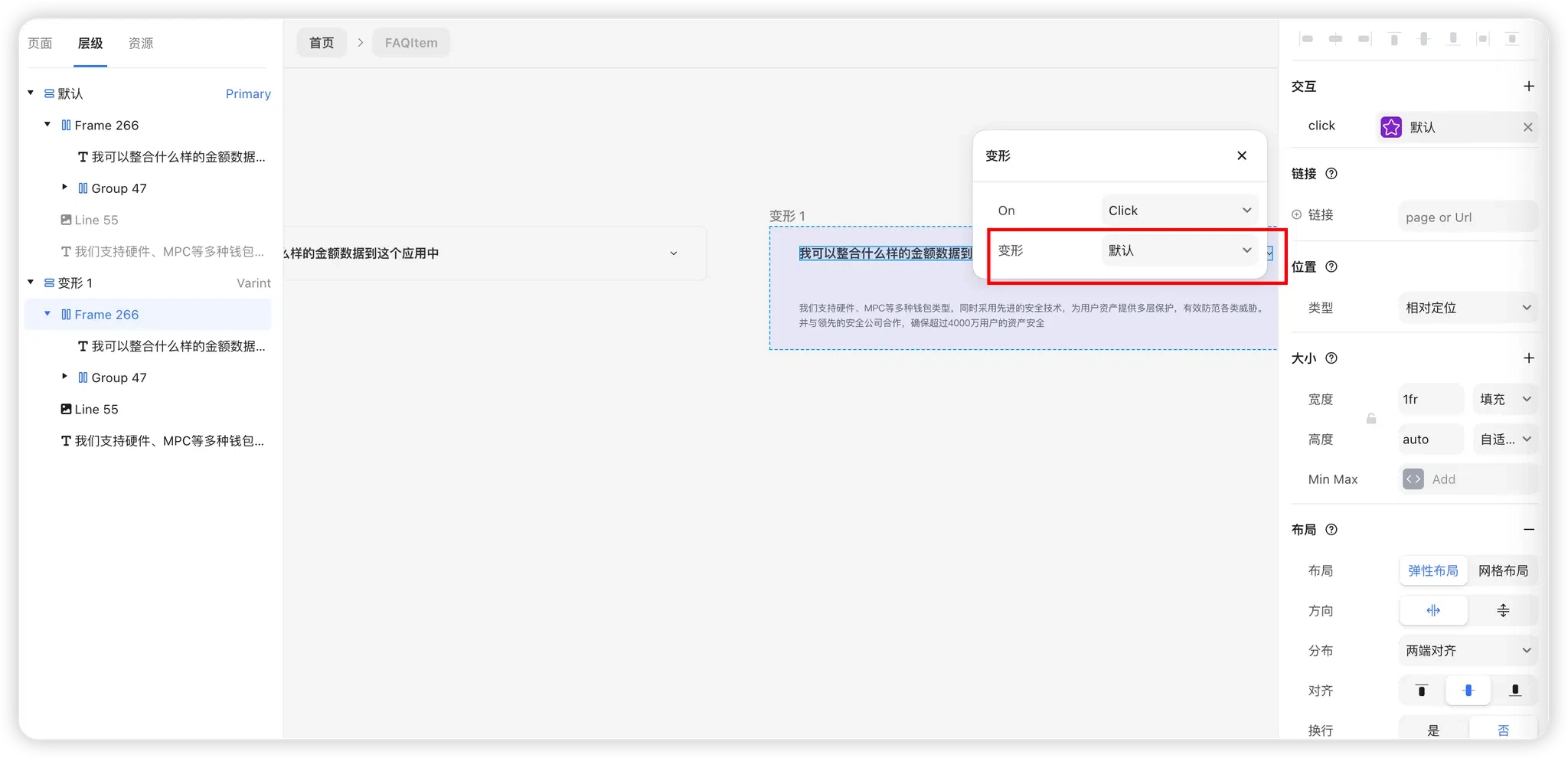
2. Expanded → Collapsed
- In Variant 1, select the title group.
- Adjust the click interaction.
Set the target variant to Default.
Preview the Result
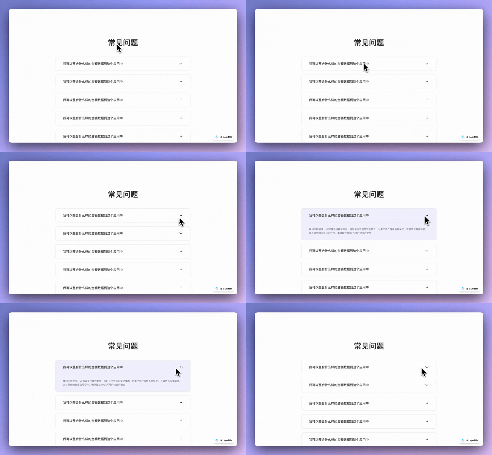
Preview the page. Clicking the title should now expand and collapse the content.
Make the Component Highly Reusable
1. Turn the Copy into Variables
Title Text
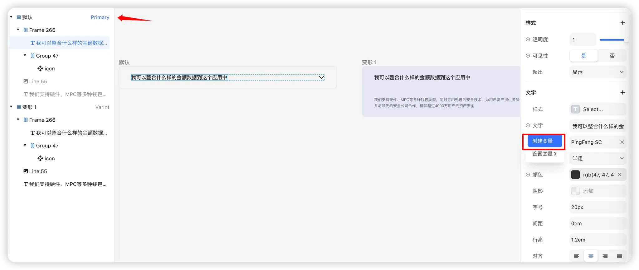
- Select the title text component.
In the text properties, click “+” → Create Variable.
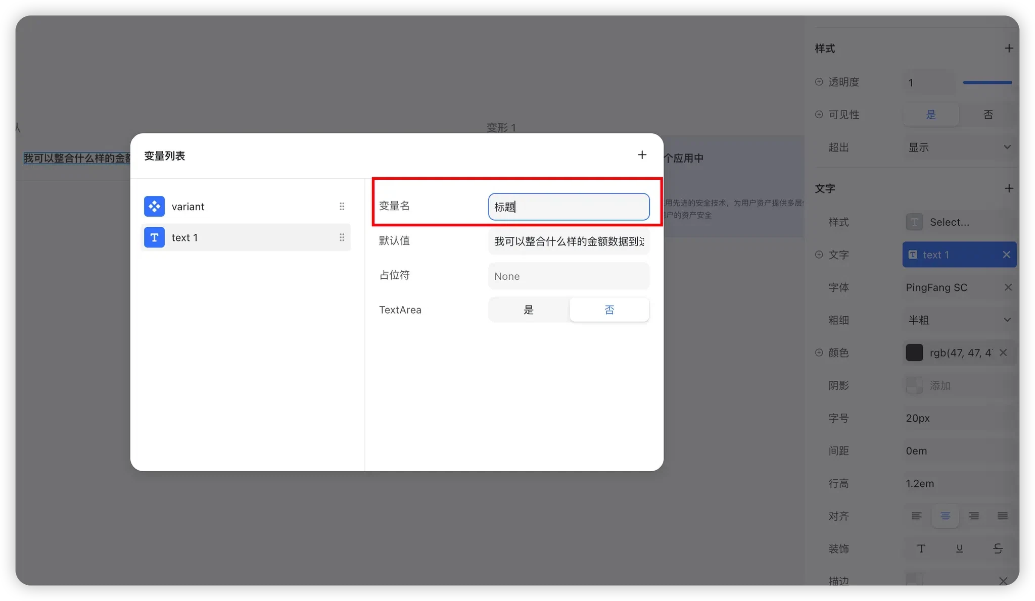
After creation, the title is bound to a text variable:
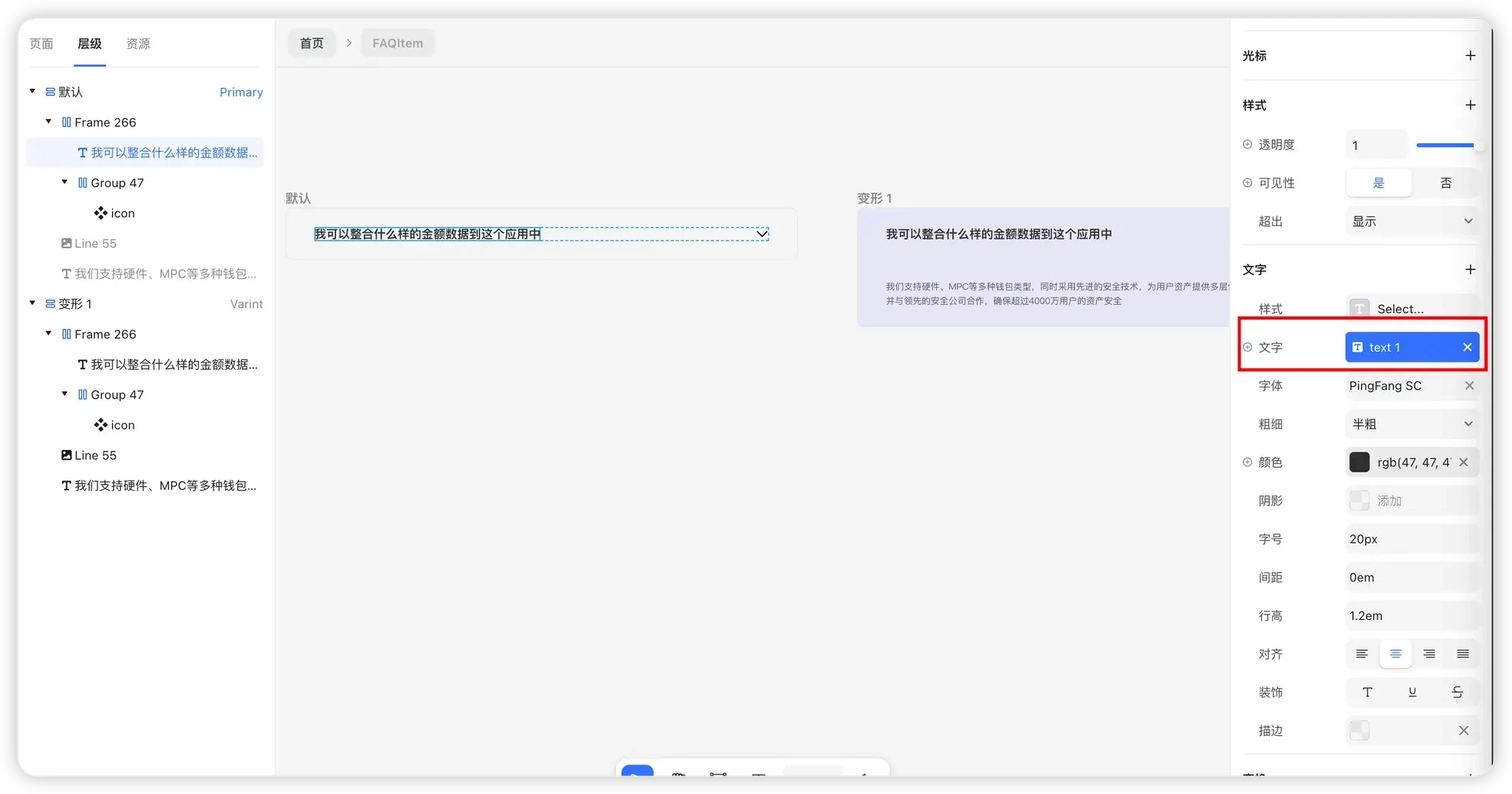
Click the blue variable name to rename it to something more meaningful, such as Title:
Answer Text
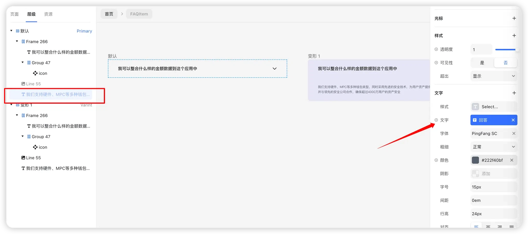
- Select the answer text component in the Default state.
Create a text variable in the same way, such as Answer.
2. Configure Component Content on the Page
- Return to the page.
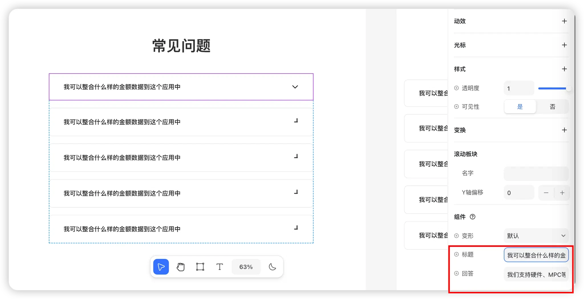
- Select the FAQItem component.
In the component properties on the right, you will see two configurable fields: Title and Answer.
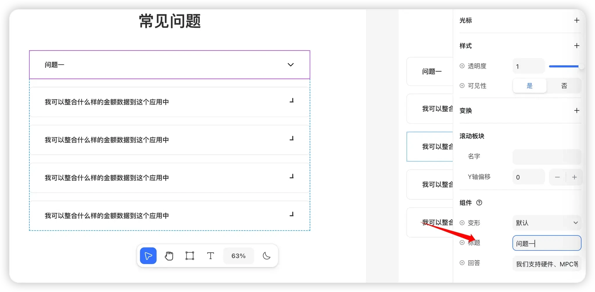
After changing the title, the page content updates automatically:
3. Reuse It for Other Questions
- Select another question group.
Right-click → Replace with Component → choose FAQItem.
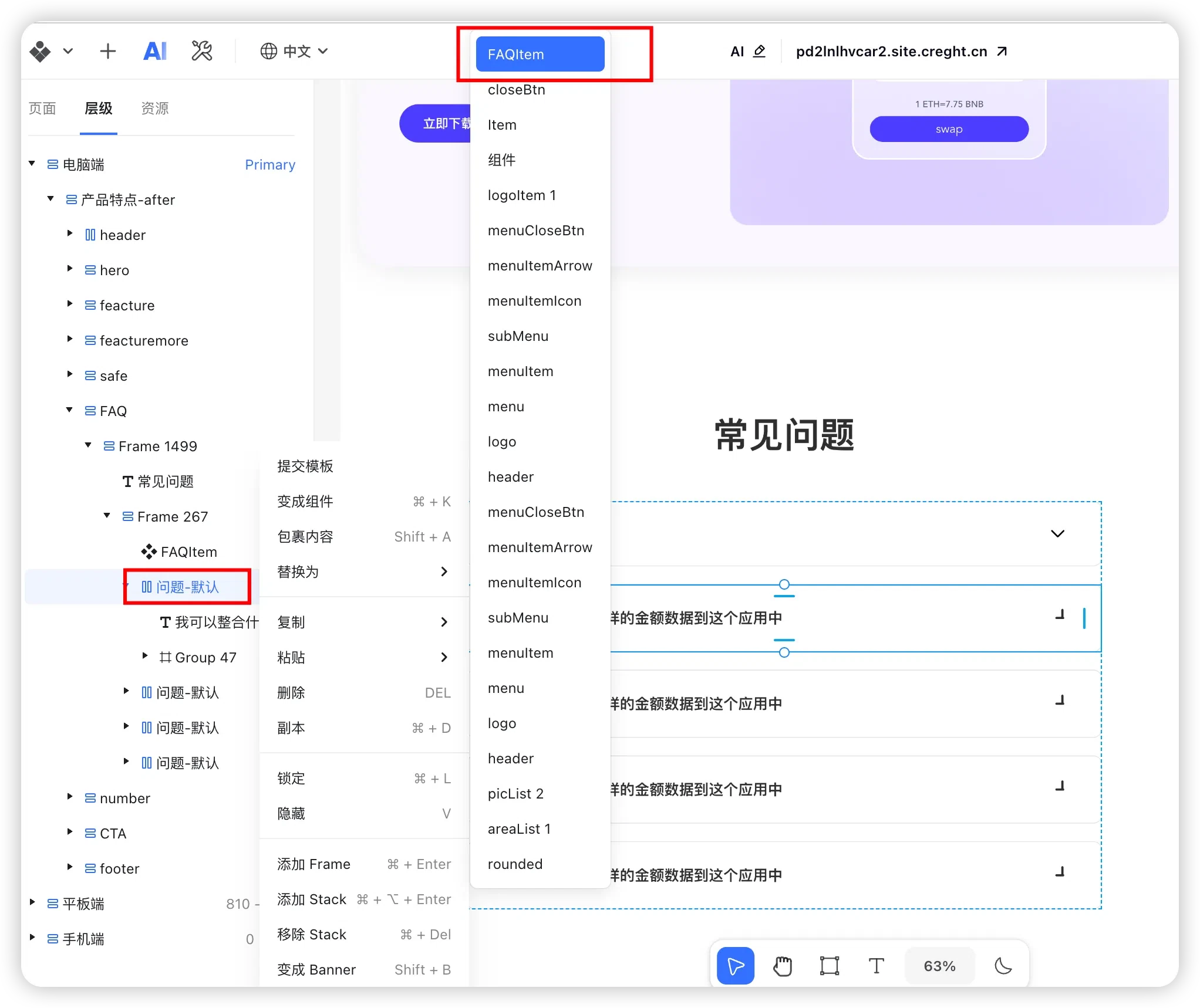
Then simply update the corresponding title and answer:
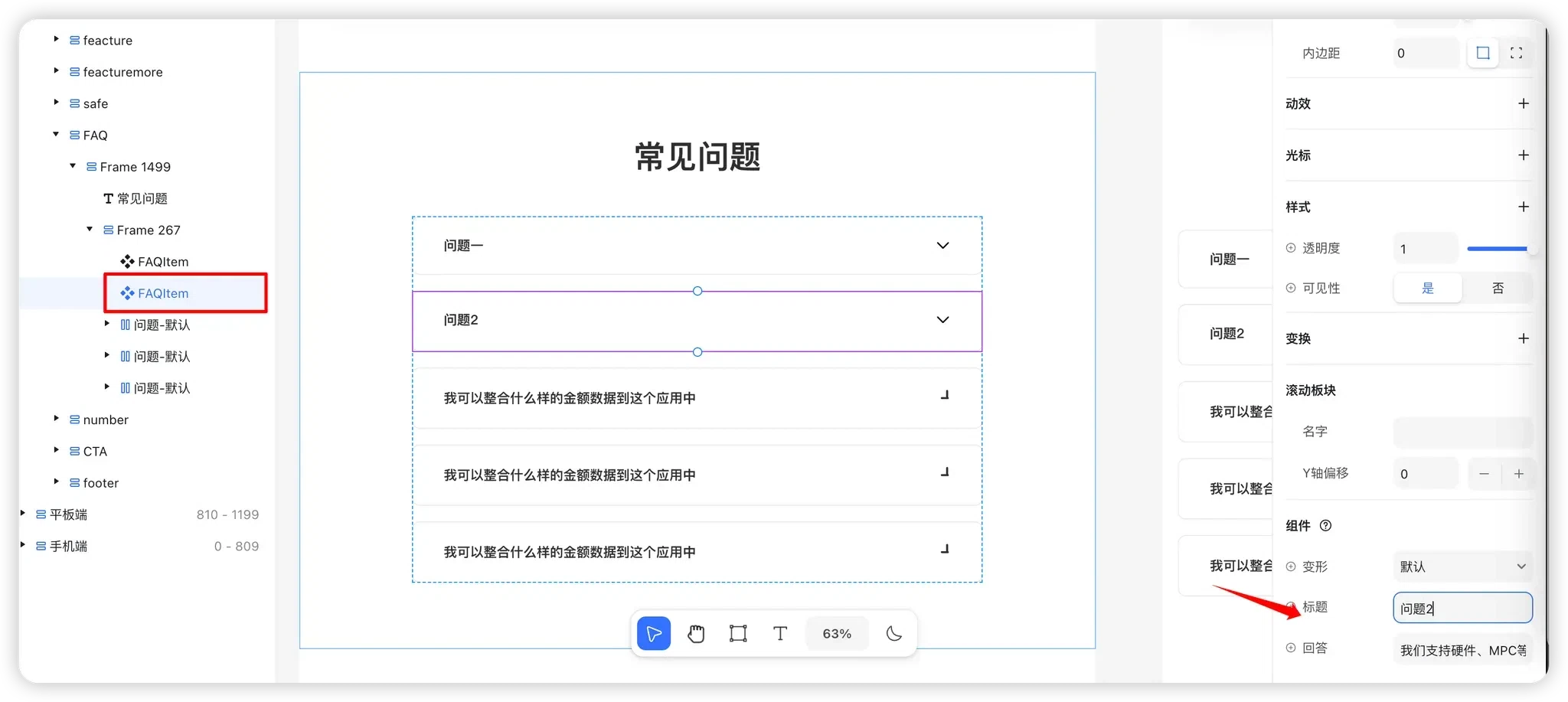
Repeat the same process for the remaining questions.
Summary
By combining components, variants, interactions, and text variables:
- You can quickly build a click-to-expand collapsible panel.
- All styles are maintained centrally while content remains configurable.
- Future component changes only need to be made once, and every instance on the page updates automatically.
You now have a highly reusable and easy-to-maintain collapsible FAQ component 🚀